As half of the group was studying from distance we worked on the interface ideas for the watch while the other two worked on filming different scene. I worked on 5 different in display options of displaying progress they were background, a check mark changing colors, the whole text changing colors and just the time deficit changing colors and lastly a logo of the transportation method changing colours. The idea was to have a neutral color in the beginning where you are on time then yellow for a little behind and red for missed bus and green to be on time.

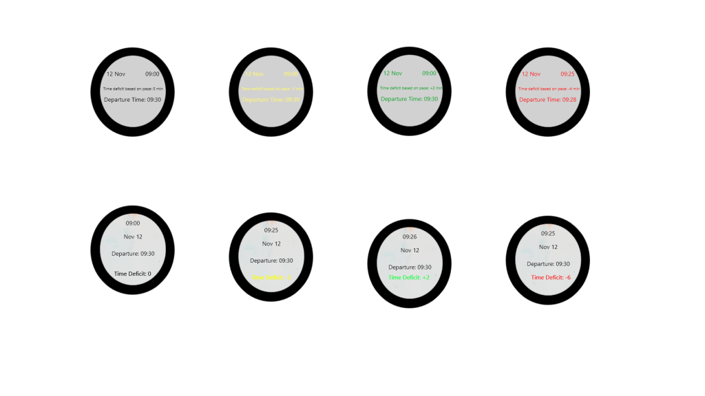

While discussing them we came to a consensus to only have the three colours as ones to tell the time since the simpler and the others have preconceived meanings which the user would understand. The first one below shows the example Miroslav’s idea for the interface then the one below it was the more refined example which was the outer circle would symbolize the users progress in comparison to the train. We used the symbol to show progress and then also a reminder when the train is going if you are monitoring in advance.
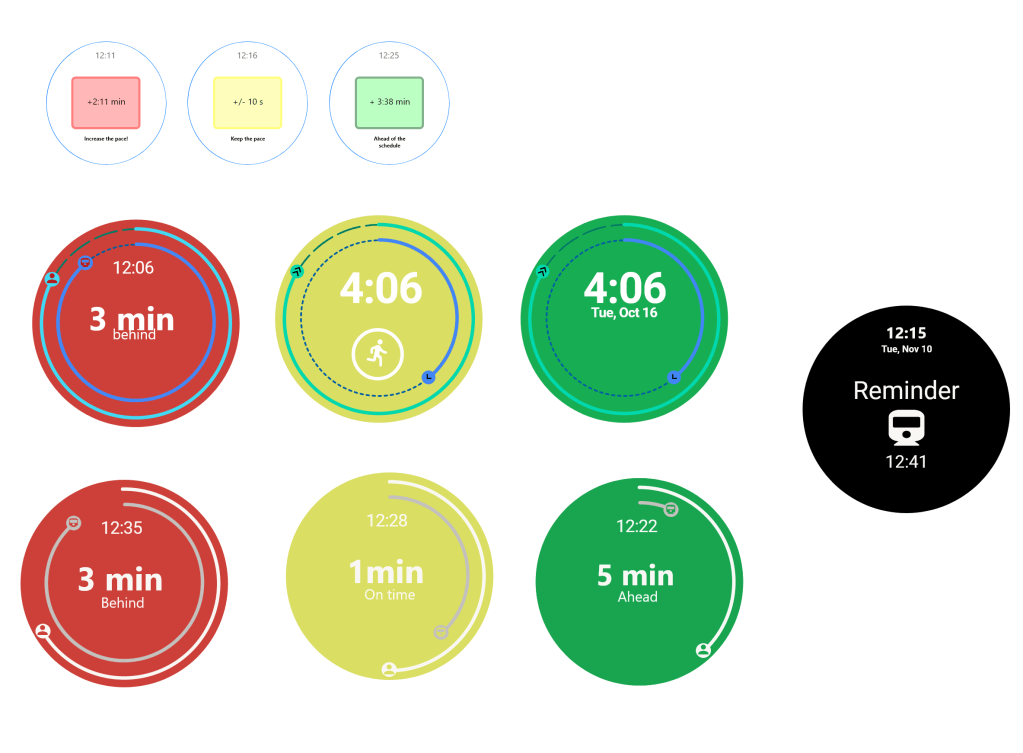
We tested out different colours for the ring and ended up with the white and grey as they were easy on the eye for all the colors as well as limited text amount which is also what we aimed for as it is glanceable.
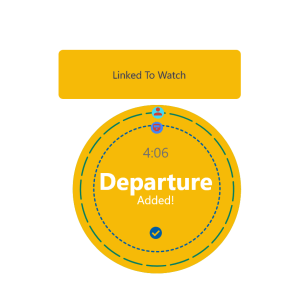
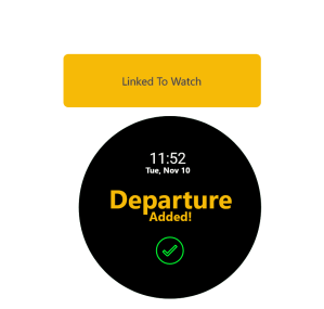
We also thought about how would we show that a departure was added so we mocked up two different ways which you can see below. The main idea with the first idea which I made was aiming to have something similar to the skånetrafiken app but then realized that it becomes a button. The second version which we used which originally said something else implemented my text as well as it being a simplistic design with the green color popping off.

Tomorrow we present the idea as it the idea of glancibilty in this idea would mean not needing to check the time of the bus/train on your phone or app in regards to changes as well. We also used sound and vibration as a way to get the attention of the user rather than have the colors change without the user noticing. The outcome of this would mean less stress and an easier and faster way of conveying information.
Feedback from summary:
For the most part people thought it had the important elements although some haven’t read the paper, some context and explanation of the criterias would have been useful. there were two opposing views on the structure of the text one saying to break it up and one said it was easy they way I broke it up. At the same time this assignment made us try to find things to critique about each other’s summaries and reach a word limit possible because I did in fact break my text into smaller parts so it didn’t become a wall of text. One said that the last sentence could of rounded up the summary better. Overall there were things to consider and build upon for the next summary.
 Abdulrahman's Blog