Tangible Embodied Interaction (Week 1 – Friday)

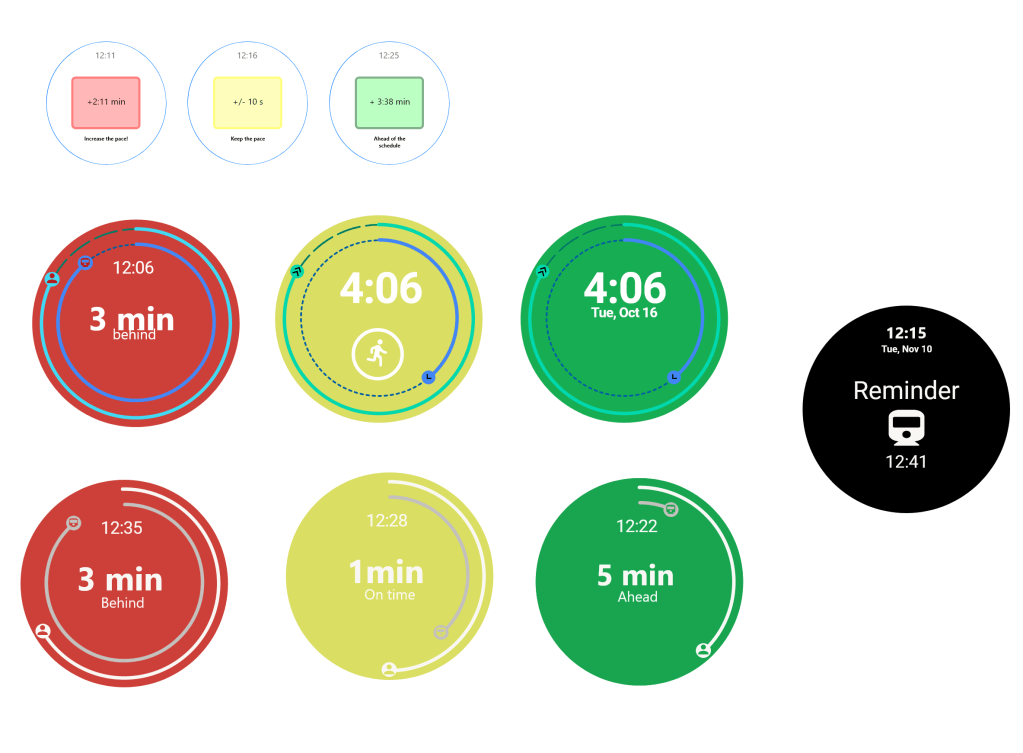
Today we presented our video. The final video prototype as well as the final different states at the end of this entry. It is easy to say our video editing skills were not the best but the scenario was understandable by people. The idea of relative time was explored which was interesting according the the teacher. The students liked the two outer circles that signify the progress of your position and the train. By using the colors it became apparent that we have preconceived notions of these colors in a way for the red and green but maybe not for the mint color which served as a in between where you are 1 minute a head but usually for public transportation you should aim to get there at least 5 minutes prior to the departure time. A slide we added last minute was the potential improvements slide where we mentioned being able to choose an earlier or later departure through sliding the screen or cancelling a monitored train, syncing a weekly schedule of monitoring times, and lastly how do we know if the person is walking to the train or driving/biking to the train station and how would that be implemented in the time display.

We included the process of the design in our presentation which the group before us did but David said that it was not necessary for future presentations as we only have 5 minutes to present. Looking at some of the other videos it became apparent that some seemed more professional and we landed somewhere in the middle as our story was relatable and by the end you would understand the intent of the prototype. With a minute time limit it was interesting to see how hard it was to fit all that we want although we went a couple seconds over the time as it counted in our presentation.

Some people did not notice the way color/time is a clear signifier of your current position and the train since the trains usually leave when the time reaches the arrival time but the counter to that is the progress bar meaning the train would be positioned at the top signifying a full circle which gives the user information that the train has arrived early but it won’t leave based on the time shown on the watch.

Tangible Embodied Interaction (Week 1 – Thursday)

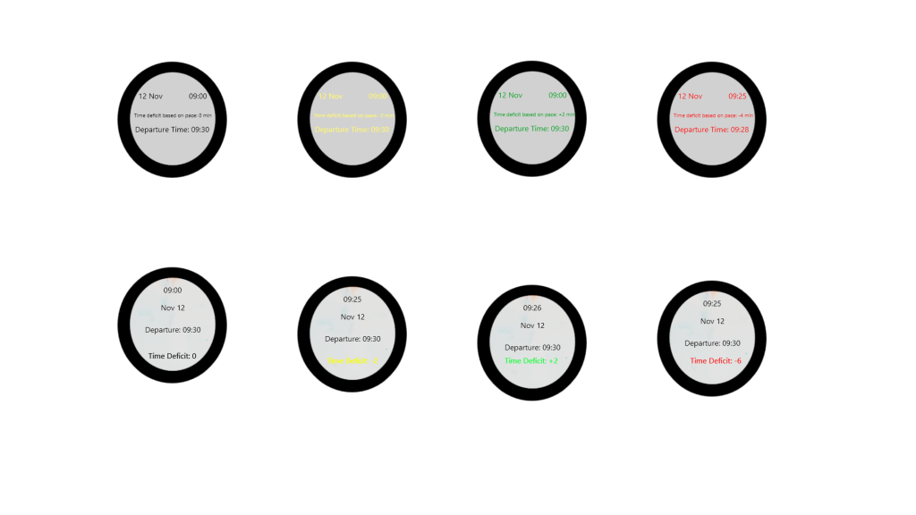
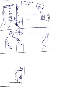
As half of the group was studying from distance we worked on the interface ideas for the watch while the other two worked on filming different scene. I worked on 5 different in display options of displaying progress they were background, a check mark changing colors, the whole text changing colors and just the time deficit changing colors and lastly a logo of the transportation method changing colours. The idea was to have a neutral color in the beginning where you are on time then yellow for a little behind and red for missed bus and green to be on time.

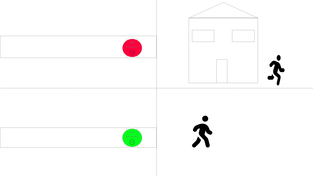
While discussing them we came to a consensus to only have the three colours as ones to tell the time since the simpler and the others have preconceived meanings which the user would understand. The first one below shows the example Miroslav’s idea for the interface then the one below it was the more refined example which was the outer circle would symbolize the users progress in comparison to the train. We used the symbol to show progress and then also a reminder when the train is going if you are monitoring in advance.

We tested out different colours for the ring and ended up with the white and grey as they were easy on the eye for all the colors as well as limited text amount which is also what we aimed for as it is glanceable.

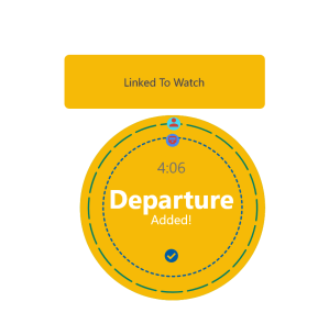
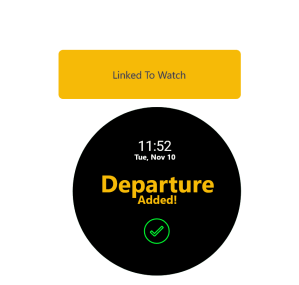
We also thought about how would we show that a departure was added so we mocked up two different ways which you can see below. The main idea with the first idea which I made was aiming to have something similar to the skånetrafiken app but then realized that it becomes a button. The second version which we used which originally said something else implemented my text as well as it being a simplistic design with the green color popping off.

Tomorrow we present the idea as it the idea of glancibilty in this idea would mean not needing to check the time of the bus/train on your phone or app in regards to changes as well. We also used sound and vibration as a way to get the attention of the user rather than have the colors change without the user noticing. The outcome of this would mean less stress and an easier and faster way of conveying information.

Feedback from summary:

For the most part people thought it had the important elements although some haven’t read the paper, some context and explanation of the criterias would have been useful. there were two opposing views on the structure of the text one saying to break it up and one said it was easy they way I broke it up. At the same time this assignment made us try to find things to critique about each other’s summaries and reach a word limit possible because I did in fact break my text into smaller parts so it didn’t become a wall of text. One said that the last sentence could of rounded up the summary better. Overall there were things to consider and build upon for the next summary.

Tangible Embodied Interaction (Week 1 – Wednesday)

We started to work on the ideas below where each person would make a wireframe for each of the scenarios.

The first scenario was a store clerk using smart glasses to scan a product to see how many are left in stock which would then show up on a tablet where you can order. By doing this it could be used in multiple ways, could be used to scan things at the cashier, scan articles of clothing.

The second scenario was while driving, the rear view mirror and side view mirror would alert you if something like a bike or a truck are really close to you.

I didn’t finish the drawing for this dea but the scenario was as follows:

Plays music on dashboard 

Gets to a traffic light

Gets phone out  music stops

Timer on the phone until the light goes green

Sound comes back when the timer is done

Bringing focus back to the car

The third idea was the one I described in the prior entry. It was based on someone taking public transportation and monitoring a bus or train through an app on their phone where they can link it to a watch. The display would show approximate time from their position to get to the train or bus and it would have real time changes based on your pace and position of the transportation method.

We then took some time to make Scenarios for the watch idea on Adobe XD as we are trying to flesh out the idea.

We all agreed on the Third one since there’s a need to use both screen displays in the scenario and it being more fleshed out. We discussed the watch also having the ticket where it’s scannable since there is control on the train and takes a bit of time to get your phone out and show your ticket. After the discussion and looking at the presentation it specified one task which made us choose by only having the position time tracker task.

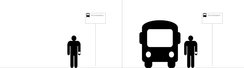
I made a wire frame on Adobe XD where the first part sets the scene and then is running late but after running he saw the change in watch. He is going to be ahead of the bus which in return means the person makes it to the bus. and we agreed on a similar kind of action where there will be 3 colours that allude to the current state either early, late or on time. The main idea would be to limit the words and have preconceived ideas from the colours and symbols. We planned that two of us will work on the interface while the other two film the scenes in real life.

Tangible Embodied Interaction (Week 1 – Tuesday)

Today we had the first seminar based on the three different papers which all

  1. Designing and Evaluating Glanceable Peripheral Displays
    Tara Matthews
  2. Exploring the Design Space of Glanceable Feedback for Physical Activity Trackers by Rúben Gouveia et al.
  3. Evaluating Peripheral Displays by Tara Matthews

Prior to requirement to partake was to write a summary on one paper which we will give feedback to two different students. I read the 3rd paper as we had less than a day to prepare we were allowed to assign each person to a paper. We decided to have two people read paper 1 and 2 and the two others read the 3rd. You can see my summary of the paper below

Summary of Evaluating Peripheral Displays

This paper talks about the different criteria for the peripheral displays using effectiveness, efficiency learnability, memorability, flexibility, usefulness, and user satisfaction in relation to two evaluating methods and two models.

The case study was based on peripheral display of e-mail notifications system through two different systems, called the Ticker and the Orb. They both used qualitive and quantitative data as some things are based on feelings and others are based on numerical scale. Qualitative is used for criteria such as user awareness, user satisfaction and distraction. This is because these aspects are more based on the feeling of the user. They used an A-B-A format which meant that one week was baseline and two weeks with them using the display, and another one-week baseline. After a week in B phase where they have had time to get accustomed to the displays is when they conducted their interviews. They used experience sampling method which they found to be difficult as they formation of questions as if they are not formulated correctly it could lead to difficulties for the participants experience. This is where they used a numerical scale (1-5) through pop-ups. They then compared data where the distraction results were insignificant in speed and accuracy.

This was written by Tara Matthews, Gary Hsieh, and Jennifer Mankoff. It is published in a chapter of a book called Awareness Systems. They aim to give the pros and cons of each example method, but they also state that if they had more participants then there would be significant outcome. They also talked about the effect of the systems not working and taking the participants a long time to realize that. This connects to the error visibility and recovery criteria where it evaluates if the user understands that the display not working and is able to recover

They compare differences between Field techniques, and lab study and field study. They also wrote about Heuristic and Summative Evaluations and how they are not comparable. As they were used in two different stages in the display development as well as they cannot be used to replace on another, but heuristic could be used to help with iterations through feedback. They also knew the peripheral displays were effective by the participants asked about their commercial release.

Reference:

Matthews T., Hsieh G., Mankoff J. (2009) Evaluating Peripheral Displays. In: Markopoulos P., De Ruyter B., Mackay W. (eds) Awareness Systems. Human-Computer Interaction Series. Springer, London. https://doi.org/10.1007/978-1-84882-477-5_19

The seminar went alright as this was the first seminar we’ve had as well as it being online made the expectations clear and I aim to be prepared in advance by reading the weekly papers during the weekend as well as summarizing them.

After the seminar the group met on zoom to start the process of glancibility project, we choose to meet tomorrow with at least an idea each to share.

My scenario was based on my own experiences with public transportation. The idea was a person using the phone app to monitor the bus which then connects to the smart watch. The time of the watch will change based on your position and the position of the bus with color changes based on your position. We will present the ideas then make wire frames to the top ones and see from there.

Tangible Embodied Interaction (Week 1 – Monday)

We were presented with the glancibilty project today. An important distinction between peripheral display and glanceable display as some might have a hard time differentiating it as was made sure by David when mentioning it.

An exercise we did was user journey where we highlighted different activities we take until we end up at the university. This showed how to cut down description to still be able to tell the story or cutting down to focus on the important parts of a design. Things such as User Journey the outcome of this was cutting down the activities to the most important things. This could be even used in storyboarding the design project or even when conducting the final video prototype as we are limited to a minute video showing the scenario which means each scene should be there for a reason.

The group I am going to be a part of consists of Lucas, Miroslav, and Christian. We have different strengths which balances out with coding, ideating, drawing, writing and presenting.

There wasn’t much to reflect upon today but we will have to read the papers for tomorrow to be able to take part in the seminar as well as writing a summary for one of the papers.

Skill in response to output

Introduction

This essay will argue that even with low level of skill the response of the interaction can be achieved by the use of audio or light as an output.   Skill is defined as “the total field of relations constituted by the presence of the organism-person, indissolubly body and mind, in a richly structured environment.” (Ingold, 2001, pp.21). The arguments are based on two different projects that used audio and light as an output. For the sound project, we explored way to guide movement of the user through panning, playback rate, and volume. For the second project there was one LED light as an output. The object reacted like a plant based on the light levels and would communicate to the user through light sequences with changes in light intensity, speed, and sequence patterns. There are ways which audio is easier to guide you than that of light through the aspects of objectivity and subjectivity of the response, what influences our response, and exploration versus observation.

Exploration and Observation

Through basic understanding of the world around us we can try to decipher what is expected of us. Tim Ingold writes the following “Through repeated practical trials, and guided by his observations, he gradually gets the “feel” of things for himself—that is , he learns to fine-tune his own movements so as to achieve the rhythmic fluency of the accomplished practitioner” (Ingold, 2001, pp.21-22). One can argue that through exploration, one can understand what the response could be through learning the skill through exploring the material. During the sound project, we found out that when using sound of a crying baby, the first instincts were to try and stop it which was in this case to lower their body to a squat like pose. This sound called for a response but still does not guide the user to what kind of movement they should pose in. While testing it out, the user eventually reached the pose. The use of light demands higher level of skill than that of sound. As an example, for the plant metaphor, when the speed of the pattern is high it gets the user’s attention, either by needing you to put it down or picking it up. Hubert Dreyfus states “involvement, one is set for further advancement, while resistance to the acceptance of risk and responsibility can lead to stagnation and ultimately to boredom and regression.” (Dreyfus, 2007, pp. 370). Involvement is a way that builds the understanding of the user’s potential, there is an example brought up by Ingold where children observe their mother’s making string bags and how the first time they would make a string bag it would not be sufficient in quality (Franz Boas, 1927 as cited in Ingold, 2001, pp. 22). This would mean that by the use of exploration one can understand what they are supposed to do, rather than observe without trying is just prolonging the process of the experience by adding the time as a passive observer. On the other hand, it can be considered that without observing one could be unaware of the possibilities of the task which through exploration could reach a stagnation based on the understanding of the material and intrinsic factors. Contrary in Easy doesn’t do it: skill and expression in tangible aesthetics states the following “the output does not really guide us in what to physically do with a product.” (Djajadiningrat, Matthews & Stienstra, 2007, pp. 668) depending on the type of output it can help guide us.  As there are universal understanding of certain aspects of the materials that can be used to become an affordance. The way it was done in the sound project was the implementation of the panner, the sound would start in one ear where the user is then motivated to balance the sound, once reached it would pan to another random place. By implementing the panner it became the vital part of guiding the movement, which also lowered the importance of the type of sound being used.  On the other hand, light communicating a response from the user is attainable for a short number of emotion but harder to decipher the response at times. The context determines the choice of the response.

The Creation of Responses

Responses are built around emotion and familiarity. There are two concepts brought up by Hubert Dreyfus, one is the intentional arc which is  a “tight connection between body and world, such that, as the active body acquires skills, those skills are “stored”, not as representations in the mind, but as dispositions to respond to the solicitations of situations in the world.”(Dreyfus, 2007, pp. 367) and Maximal grip which means that “the body’s tendency to refine its responses so as to bring the current situation closer to an optimal gestalt. Thus, successful learning and action do not require propositional mental representations.” (Dreyfus, 2007, pp. 367). The intentional arc brings up an interesting point of the acquiring bodily skills are through the world, and how the body adjusts its response based on the predicament. Sound could be experienced through an explorative aesthetic that invokes a response easier than that of light. Light as an output usually is more subjective but works at getting attention while at times as it is harder to communicate through it. It could easily lose meaning of response as the following is stated “the visual changes on graphical displays cannot directly steer our actions.” (Djajadiningrat et al., 2007, pp. 672). In today’s world, we can have an app guiding us through a map to get to the desired destination based on our location. Although there are also levels of skill based on the way one is being guided. Walking while being guided has a lower error and is a skill we have developed since a young age, driving on the other hand is something we learn at a later point in life, it becomes a question of guiding people’s movement versus response. They differentiate on between essential and cultural relevance but depending on the context driving might be essential as well.  While we might not follow directions from an app because at times the skill acquired from the experience builds more efficiency through acquiring skills, like knowing shortcuts. The need to imitate is tough to succeed at, since there is a difference on how we actually perform the interaction ourselves than picking it up through observing a display. On the other hand, in sound an observer can pick up on the experience and could be effective in getting more people involved, while one light output cannot be picked up by many people and experienced as an observer as sound has a higher peripheral range.

The need to imitate lessens the nuance rather than having a more explorative look where the user starts to understand what is needed from them. There could also be means to do things differently especially when the material output acts as an affordance. “the key to imitation lies in the intimate coordination of the movement of the novice’s attention to others with his own bodily movement in the world.” (Ingold, 2001, pp.21). Using the plant metaphor example, it could be said that when it alludes to “dying down” through dimming of light and the speed of the sequence, it could be communicative through imitation within the material output, such as imitating a heartbeat, it could in fact be subconsciously effecting the perspective of a user’s response. A novice should be able to explore interaction and eventually understand the different states as complexity should not be an aim in the nuance of the output. Rather relatability as well as it being easily understood through the human experience is what solidifies a strong outcome. It could be said that the output can be understood if it is based on the understanding of the human experience. Dreyfus talks about cars and how one has the intuition to know when the sound of an engine is properly functioning and when it is not. It could also be observers knowing that something is not right but being guided towards what you are supposed to do, is much more difficult for an observer and in most cases the driver as well. You seek someone’s expertise level for example a mechanic to help you as the level of skill shared between the user and observer are similar. This becomes a question of complexity of a response. While there is some level of consensus of what certain things mean such as a light sequence that blinks fast but by getting the attention similar to a sound like a siren, it can guide a response.

Subjectivity and Objectivity

There is an emotional side to experiencing the materials as an output, which influences the response. It is important that when you have an interaction, it invokes some kind of emotion.  Hubert Dreyfus states that “learners find themselves on an emotional roller coaster.” (Dreyfus, 2007, pp. 370). That could be seen as one of the most important aspects for someone to be emotionally affected by the interaction it calls for a response. “Nicholai Bernstein argued: The essence of dexterity lies not in bodily movements themselves, but in the responsiveness of these movements to surrounding conditions that are never the same from one moment to the next” (Bernstein, 1996, cited in Ingold, 2001, pp.21). As in human nature we have some understanding of sounds and their connotations and response. During the sound project, we used a baby crying as the guider of movement as the first thing that comes to mind would be to stop it through a person going lower. Through asking fellow students it became apparent that they knew what the aim was, but what if there were other ways within sound for it to be used as an affordance. Playback rate could be a factor in guiding a movement, but it becomes difficult because it depends on the familiarity of a given sound and finding the right speed. On the other hand, while there is some level of consensus of what certain things mean such as a light sequence that blinks fast, but by getting the attention similar to a sound like a siren, it can guide a response.  Sound as a material is less abstract than light, when light is used it is to get you attention that can cause a response, but sound could invoke feelings and is easier to describe. By exploring a more nuanced way of the experience of light it can mimic real life occurrences to get an idea, but it would still be subjective while sound could be considered more objective.

The intuition of one has in the experience of being guided builds skill. Dreyfus states that “In fact, at the movement of involved intuitive response, there can be no doubt, since doubt comes only with detached evaluation” (Dreyfus, 2007, pp. 371). This is not necessarily true as intuitive response can be wrong since there will always be new experiences based on situations to build upon and understand. While working with the light sequences as a way to guide a user, we found out that only in basic level of understanding emotions through sequences, users needed to categorize the emotions but would not be understand specifically since with one light output it becomes harder to act as an affordance. While the following is stated “intuitive behavior replaces reasoned responses” (Dreyfus, 2007, pp. 371). That could be true in the sense of being in a similar predicament, you can learn to adjust the response but to be intuitive without reasoning in an interaction could lead to the user’s skill level reaching an equilibrium. “It is crucial that the agent does not merely receive input passively and then process it. Rather, the agent is already set to respond to the solicitations of things. The agent sees things from some perspective and sees them as affording certain actions. What the affordances are depends on past experience with that sort of thing in that sort of situation. The idea of an intentional arc is meant to capture the idea that all past experience is projected back into the world. The best representation of the world is thus the world itself.” (Dreyfus, 2007, pp. 379). Dreyfus talks about cars and how one has the intuition to know when the sound of an engine is properly functioning and when it is not. It could also be observers knowing that something is not right but being guided towards what you are supposed to do is more difficult as an observer and in most cases the driver as well. You would seek someone’s expertise level, for example a mechanic to help you, as the level of skill shared between the driver and observer are similar. This becomes a question of complexity of a response. As affordance was found through aim of balancing the sound in both ears which is a part of the intuitive side balance is something everyone knows the experience of so by connecting the human experience in the world the skill becomes easier to comprehend.

Conclusion

In conclusion, through exploration of material, one has to understand the level of complexity needed for the interaction to take place.  The use of sound as an output has more objective characteristics that invoke emotion which in return could be used as an affordance.  There is a level of objectivity needed where the different responses are categorized through emotions being invoked and users being involved. Mimicking real life through speed of a light pattern (output) like a heartbeat. The context and personal experience play a part in the skill the level of response. Sound as a material is less subjective through exploration and acquiring the skill than that of understanding light patterns in guiding movement.

Reference list:

Djajadiningrat, T., Matthews, B., & Stienstra, M. (2007). Easy doesn’t do it: skill and expression in tangible aesthetics. Personal and Ubiquitous Computing, 11(8), 657-676.

Dreyfus, H. L. (2002). Intelligence without representation—Merleau-Ponty’s critique of mental representation. Phenomenology and the Cognitive Sciences, 1(4), 367–393.

Ingold, T. (2001). Beyond art and technology: the anthropology of skill. Anthropological perspectives on technology. 17-31.

Interactivity M3 (W3 – Friday)

We presented our sketches today, I believe it went well reason being was that by structuring this show and tell in the same way as the first show and tell made this presentation better than the second module.

The teachers liked the idea of sound as and affordance. Jens brought up the original idea that we had to make the sound control you but we didn’t have enough time to fix a 3D audio to make the person move. Furthermore, they also presented this idea of inviting vs obeying vs constraining which was interesting since these aspects could have been used in some way in this project to further our outcome. Look at what made this interaction become a guiding movement it would be the panner and the main constraint would be the height and the wrists needing to be put together.

Although we had our final sketch based on the use of headphones but a pointer we got was setting up with speakers, unfortunately the audio of the videos we showed wasn’t working as there was feedback from zoom. This is an area of improvement although we didn’t know that there were speakers at our disposal we should have at least asked

I also believe our time management of the show and tell could of been better as we ran out of time so the conclusion had to be cut short. This module showed the importance of time management as a lot of the time code took a lot of the time that could used to reflect more but through out the process I believe that this module was the most reflective I’ve been thus far as I tried to document through videos and sketches as much as possible. Days where there was no real reflections were since it was just trying to get the code to work which I need to work more on since by being more efficient coder the design process will become better.

Interactivity M3 (W3 – Monday)

During coaching we discussed constraints and challenging, how can we have some sort of non-challenging constraint although we have had thought of it becoming a guider to a movement that could be deemed challenging.

It feels like it’s more of a controller at the moment as we haven’t pulled the different aspect together but by having the audio sample of a crying baby it becomes more of a set goal of the interaction which is to stop the uncomfort which is something that can built on by thinking along those lines.

We decided to move from it being a right or wrong kind of movement but there is still constraint on how it is experienced as they are one of the

We are moving more from this controller kind of feeling and I believe once we put them together then it would start feeling of constraint and implicit motivation.

The different constraints that we identified are audio, physical, social, and spatial. In the final example we are using audio and physical as our main area that we are using as we were told on Friday to focus more on one or two constraints than touching on a couple more.

We worked on having 3 different dimensions used within a sketch where one would be guided through the sound to follow the panner position which changes based on the position of the sound, when the desired place is reached the sound will balance coming through both ears on the headphone. The volume also higher the lower you get vertically. Horizontally movement changes the playback rate of the audio. The audio only starts playing once both wrists are held together. This interaction needs headphones and we are unsure at the moment how he will show it to others. The videos below show the interaction that we ended up with.

Interactivity M3 (Friday – W2)

Today I shared the the playback sketch where the sample would become faster the further you get from the body parts and vice versa. This wasn’t what we initially wanted but it is playing with this sound idea. By implementing a sound like a crying baby it helps the interaction becoming trying to stop the discomfort of the sound and responding by trying to stop it.

Playback rate code

I got the playback rate to work as you can see above, originally it was supposed to be change in pitch but I wasn’t able to get it to work properly. The experience of this suggests one pose over the other. Could become a guider through having the correct playback rate of the sample at a specific point.

Constraints:

  • Physically –> not being able to lower a sound completely through elastic bands (Volume)
    • How can we make sound constraning through movements
    • What sounds? (annoying, closing the body, desire to stop the sound?)
    • The experience became more challenging but it had a contraining aspect to it.
    • We can implement this to have the constraining aspect strongly present

Visual + height restriction: There was a vignette effect where the canvas becomes brighter the closer you get to the specific movement which was to squat down for the sound to stop. The sound used is ghost frequency which is supposed to make the head vibrate and a sense of discomfort. What we found out was that you need in-ear headphones for it to work properly but our class mate was able to do the desired move.

The example above shows an implementation of the volume and playback rate in the same example. The constraining feeling is reached when the wrists are met. This could be a fundamental part of our final sketch. We still lacking the guiding movement aspect but we are looking at panner. We are at a point where it feels a little like using the body as a controller.

We have achieved a more continuous feedback aspect. We also tested sound that is annoying such as crying made the users want to stop it. sounds that call for action which did work similar to the height restriction one but how can we lower the importance of the kind of sound to guide the action.

Coaching:

During coaching we discussed how can we guide the user to the pose where an idea arose of having the sample working at the correct playback rate as it can become a better experience than going down and the sound stopping. By implementing that it can become a good way to communicate that the desired pose has been met. But if we want a more fluent experience there shouldn’t be a right pose but rather the sound inputs being used as a way to guide through the output.

We also discussed how it is better to focus on one aspect rather than multiple, since we had a little of everything. We decided to leave the visual and physical aspects and focus on the main one which is sound.

We discussed how can we implement more dimensions. We out the playback rate idea and volume together and we aim to have a panner controlled by the core of the body position.

Interactivity M3 (Monday -W2)

We shared the ideas of the different movements we have came up with. and how we can implement an output to these movements. What could be considered a good output for these movement, should it be an uncomfortable feeling which you are trying to level out or should it become something calming or can it be any sound guiding your movement, that is something that we need to explore more as it is an important component of this project.

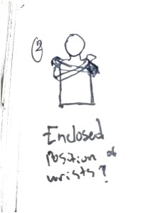
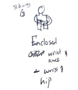
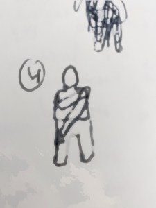
We explored the feeling that the movement have which are enclosed and are either comforting or discomforting poses to do. You can see some of the movements below:

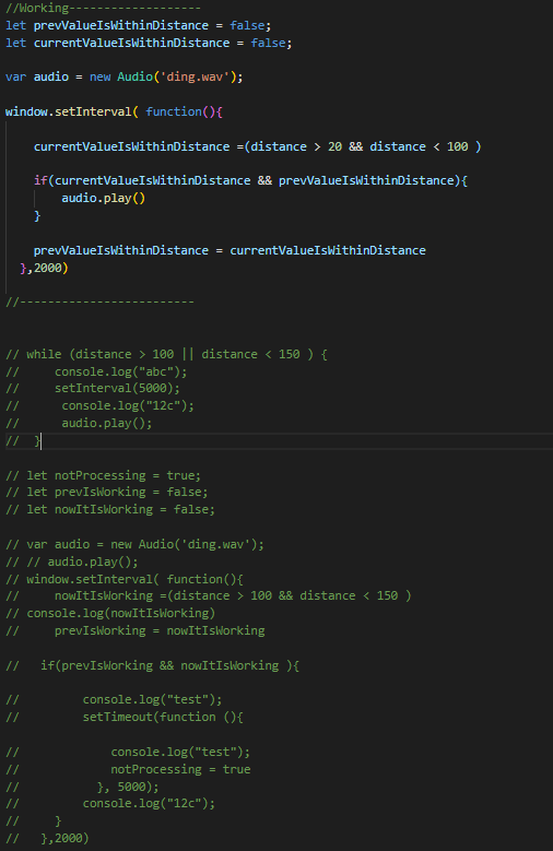
For the interaction to have a more continuous feedback, the code I made was not sufficient as it is a boolean based when rather having a dom listener and by using the WebAudio API to guide the sound rather than my initial thought of implementing a faster solution where the different sounds gradually would play according to the range of the distance between the wrists.

This was mainly to see how it feels to have a timing threshold to a pose to be registered with an audio feedback this was helpful as it became apparent that we wouldn’t want to go to that route as it was more of a controller kind of thing where it not as continuous interaction but with the implementation of more dimensions it could become more useful as we are aiming to work on volume and playback rate of a sample and then build on the dimensions and use them to guide the movements of the explicit motivation kinesthetic and the constraining movement.

Interactivity M3 (Week 1-Friday)

An interesting aspect that was brought up during the lecture was that to have a shared experience between people like a handshake where you are sharing that experience rather than have someone looking in. As we are thinking of the theme of constraining movement, we discussed having crutching as a sort of height restriction. The idea of expressive vs compressed movement arose. This fits perfectly into the enclosed body movements . As a way to help us move forward we wrote down different values we can work with and the different outputs we can use. An important thing we need to start manifesting is the continuous feedback . A question we thought of is if we could set a speed level to the movement to count or even that the user has to hold a certain pose for a set time for it to register and in return it would give some sort of feedback.

We started thinking of constraints and dimensions to implement:

How fast can you put the wrist together?

height restriction

  • crutching for something to work you have to be below a certain height on the y axis.

Could we restrict the body position (Expressive vs compressed)

  • one side of the screen moving from a black and white interaction

Values we can work together:

  • body part
  • distance
  • speed
  • time
  • position

outputs:

  • visual
  • sound
  • arduino

Continous feedback? – video – something is getting picked up continously

Stretches? when two parts meet

–> visual output of it being met

Exercise & warm ups

At this point we were unsure on how to move forward so we decided to jot down a few concepts of interest and start cutting down:
– Stretching

  • Stretching
  • Exercise/warmup
  • Secret greetings /Covid Greetings
  • Body Precaution (drum) (X)
  • Body music –> Closer you get to the screen the pitch of a sample gets deeper

We knew that the music would be tough and leaned towards exercise, and stretching then we landed on a form of dance called Butoh.

An important thing that we did was figure out the different combinations that we can have to test it out. if marked x then it does not register.

  • right wrist – right kneee
  • left wrist – left shoulder
  • upside down (x)
  • Right wrist -left ankle (x)
  • Laying down (x)

Coaching:

  • Encouraged to go more into constrained vs Expressive (input)
    • the idea of constrain is similar to what we have been thinking about as we had closed body movements within our body combinations.
  • Remove feed (Canvas)
    • As this was the default we can move from having a visual feedback to show as what the different possibilities are.
  • opening up–> cause an effect (Output)
    • Similar to the ding example where it had a sound feedback to show us the condition has been met.
  • probing the bodily experience
  • body pose of closed body
  • height restriction of (lowered vs height) as a vertical vs horizontal compression –> movement and response
  • Pressuring as an output
  • Explore more into: Depth of it through iterations, continuous output of value

Adding qualities to the movement

–> more ways of being expansive

Chloé brought up an interesting type of dance that is inspired by pain after WWII devastation on Japan. We looked into possible movement from the Butoh movements as we are looking for enclosed/constraint bodily movements.

For Monday:

Explore different Standing, Critching, and sitting movements through expressive vs constraint.

Interactivity M3 – (Thursday, Week 1)

I was able to make an example work today where a sound would play a ding once two parts meet, which in this case the two wrists. although it was not that interesting with the use of wrists it implementing the time interval where for the pose to register. What we found out was that we will not really use the timer idea since it could become tougher and some what a controller. Once the specified range distance is reached the ding sound would play. My computer kept crashing making the code, I don’t know if its because of how I made my code or if the file is demanding.

We started by reflecting on the ding sketch, questions such as how to change the experience such as making it rather than when your wrists are close to each other it makes a sound when your further away from and more open body movement. We also thought about making the user need more stillness, but then it becomes more of a challenging experience than what we want to look at.

We want to build on the ding idea by thinking of combinations of constraining the bodily movements. Thoughts such as changing the interaction from wrists to the ankles instead.

We got a fellow classmate that had no idea what it was to see if they could understand what was happening, which they did. We didn’t get any coaching today but hopefully tomorrow. We aim to think more about what exactly are we going for theme wise, and tinker with the code.

An interesting video that I found that uses kinesthetics and sound, an idea that came from that is having a continuous output which will take us on the right path.

Interactivity M3 (Tuesday -Week 1)

We decided to start by picking a parameter from the seven that were introduced in the paper where we found that explicit motivation was the area of interest as it entails that the input would be understandable and it wouldn’t take much to figure out the intentions of the interaction.

The first idea was to implement sound as an output through different body part movement to control a drum as an example the movement of the hips relating to open hi-hats.

We then thought of what kind of movements/outputs which include visual, audio and physical:

Constraints of movements:

  • Height restrictions
  • When you hit a point it shocks you
  • Minesweeper with a glove to control it and a shock when the landmine is used
  • Car game going from hand to feet control of a car game
  • The closer you get to an are the warmer the further the colder
  • Time constraint
    • Holding a pose for 5 sec in order to do something.
    • A hole in the wall

I believe if it becomes “A hole in the wall” kind of experience it becomes more of game than something nuance since it would use the camera as a way for the user to be guided on what the intended movement is. Another thought was if there was a way to know if the desired movement is the correct one and if there would be a “confirm” to a move which was inline with the idea of Minesweeper. We thought about that there is some sort of initiation time where the output only comes if a specified distance is reached for 3 seconds. We thought of movability as well but chose to go with explicit motivation as movability was too broad.

Jumping motion to confirm movements

Bigger movement — bigger motion

We decided it lands more on the explicit motivation than the movability as it is too broad.

If the value of distance is 300 for 5 seconds then 

60 and under -> play sound

Computer kept crashing which makes this code demanding, hopefully we figure out a way for the computers to handle it. The cause could possibly be loops but there is a lot of demand on the computer even when removed.

Interactivity M2 (Friday -week 3)

Today we presented our device which was not functional correctly. We didn’t produce many things to show which we knew was going to be a topic of discussion during the feedback.

In hindsight we were thinking more of the different states and how they would look as in the beginning it was subjective feeling of what the different states represent which we were trying to play with the different parameters to show them such as altering the speed of the sequence, playing with the pulse and the brightness.

They said that the plant metaphor example was an interesting thing to pursue although when we brought it up in coaching we were told it was too conceptual and to move to a more abstract example. So we had this object with its main thing was for it to look inviting to the user to pick up and move around. We did not succeed in making the code for the sequences to work together but we did have the different states. The main issue was making them work in the conditional statement that we used in the loop as well as the implementation of delays in the different examples.

The first state was supposed to be a calm state but in the show and tell based on the lighting and the issue that one of the sensors would pick up high light intensity 

Unfortunately we found that out too late to change it, due to us going back to the sequences more and thinking of the light sensor as the way we wanted to work with only because we didn’t come up with different ideas for the proximity meter and that I only had an ldr at my disposal so we leaned more on it.

Although I was with presenting the sequences which you can see in prior entries as it would have added more about the process than showing and talking about it rather than just talking about it. Unfortunately it all fell through in a discussion if that would be useful so we aimed on making the object respond by the different states instead.

Although Jens said we took too long to start producing during a coaching session with him he told us to take a step back and go back to sequence to explore a story to tell, at times it can be difficult to know what is the right thing to do when there are changes in stances or times where we should not take the advice in a way for example when we were working on the plant idea that reacts to the different light levels in the room.

This has been a learning experience, although we didn’t have much to show we were given advice on time management while on the other hand it was more on the technical side of the project where we fell short

Interactivity M2 (W3 – Thursday)

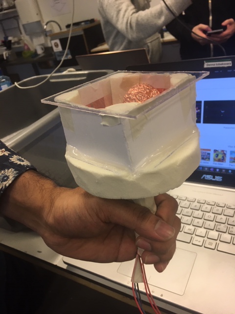
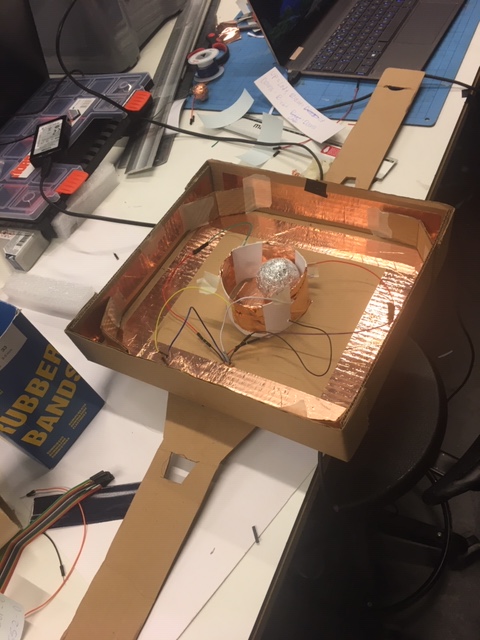
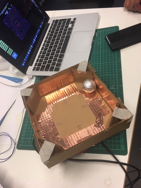
Today we started working on implementing this abstract inviting feeling of the object. we started with a hexagon shape then later changed it to a pentagon shaped object as it could be seen below. It had a similar shape to a football which makes it have a similar characteristic to that of its inviting feeling. We spent a whole afternoon in the workshop making it different sizes and the one you see below was the one we felt was best as it exactly fit every component. The bigger one we made the movement would effect the cables and disconnect easier than a much tighter object. there are 6 sensors as well for similar use as the plant metaphor where one would be used for direction.

Making the object
Putting in the different cords
Final looking object

For the sequences I was the only one ready with mine to show and decided on implementing the following states:

Charged up state is where the object has received a high level of light intensity after being in the dark for a period of time. This experince could be considered to get the attention of the user as similar to some plants too much light could kill it similarly to too little.

The bloom state has loading feeling, this is where the object has been in the dark for a period of time and one of the sensors receives a higher light intensity. The experience is somewhat calm as it going back to its equilibrium state.

Calm state experience is a slow, sleepy kind of feel to it which I believe would resonate with a lot of people where it could be seen within the pattern, similar to slow breaths.

The put down state is also categorized in a attentive state where the user is called to put it down as an alternative would be similar to calm state but the user would only know that the interaction is over as if it is similar to holding a pet.

The disturbed state experience is it takes your attention as the speed is used, this state is when there is a high level of light. Could be better if there was another phase of the sequence where there was an even faster speed in pattern, as it could show a state of panic.

The experience of shadow long is a feeling of needing something, asking to be moved for example. It could be said that I might have a bias towards these sequences as I made them but my teammate seems to agree with them.

We had issues bringing all of them together to function according to the planned sequences based on the light intensity. Throughout this course we had to use the code but haven’t got fully acquainted since this was the first time working in pair where both people haven’t used the arduino much before which meant it took us longer to tinker with the code and try to make things work.

For tomorrow we hope to be able to show something working as we have made our object movable which was a step in the right direction but maybe we worked faster in the past week and a half than the first half as we were moving too fast and lost at times.

Interactivity M2 (W3 -Monday & Tuesday)

Today we worked on making the sequences of each example within the idea of having a plant metaphor for our object where it would be able to react to the different light outputs and react accordingly with different sequences. We had 6 different LDR sensors and one of which was to tell the direction of the object as we would have an agitated state/”put me down” state when the object is picked up as that is the nuance in our example, using light as guiding tool of what is expected from the user. The difficulty of that is at times the light sequences become subjective of what the user is meant to do. Things such as calm, dying down, agitated/mad are understandable. But within the shadow long things such as a heartbeat could be understandable but being able to distinguish between them might be difficult.

This became clear as now we have are thinking of sequences that could be useful for this abstract object. We can still implement sequences that we already agreed upon for the plant metaphor idea but it wasn’t ready. We had agreed upon the calm state, bloom state where it goes from the shadow to a good amount of light. The experience of those was we found common ground on what it should look like as categorized emotions and build from there, since if something is blinking fast you either attend to it or leave it alone depending on where the user is.

For thursday we aimed to make different states for this object to become something more abstract as during coaching we were told it was too direct as well and to move from something that has its own preconceived notions. Now our mission was to make something that looks inviting to play with. We will also each try to have the different states ready for thursday. By having each of us do one of each it can become clear as two people have different perspectives on what the experience would be for irritated but a common ground would most likely be found.

Interactivity M2 (W2 – Thursday)

We shared the idea of working with implementing a face to the interaction which was deemed to be too direct by Roel. We started thinking towards something that moves away from the computer and have a thing we can experience differently through moving it to other places. So we started thinking towards having a ball that signifies plant like behaviours through the light sequences communicates with the user on what the next step should be. So we started working on different states. Pick me up state, Asking for light, if it’s shadow vs in the shadow for a long period of time, calm state and put me down state , just to list a few. Unfortunately we that idea of a ball didn’t work to represent it. We are planning on having six different sensors as we can use the direction as one, which could be the agitated state.

I believe there’s something here with the plant idea with light being used as an affordance especially that the object communicates with you rather than it being based on the user communicating with the object. By being able to move it away from the computer to other places could be really valuable on the experience of the object. My team mate said he will try working on having the sensors within the ball tomorrow as I will be unable to attend but will work on sequences and alternatives of sequences. We will present our idea during the next coaching session and see what we can do from there.

Interactivity M2 (W2-Monday + Tuesday)

As a way to move from us being stuck we brainstormed an ideas on how can we make a story, and what kind of story. We worked on the idea of sleep and building an idea around it. We aimed at telling a story of the different states of sleep where you are calm when one is sleeping, a short agaited state if there was a little nose which makes it easy to wake up from and then goes back to calm state then lastly there is a mad state where one is woken up. This is us trying to build a story of how this object can be tested and tell a story. We couldn’t get feedback today but hopefully we get some reassurance until then we will work out our different states for the following states:

  • Sleep- calm characteristic
  • Irritated – goes from calm to a couple of fast pace blinks then back to calm and so on
  • Mad- fast blinks then a light on state for a 10 second duration to signal that it was disturbed and now awake

We were able to accomplish our aim and wanted to make different sequences that allude to the different emotional states.

The possible issue with this idea is if its too based when did a quick prototype with a drawing of a clown with the light going through the nose. As we are giving it a face it could become too straight forward which we didn’t have the chance to get some coaching on today but hopefully on Thursday.

Interactivity M2 (Week 1 – Friday)

Today we showed each other what we have been able to make with the two sensors. I used the Light intensity sensor and Mihhail used the proximity sensor. I got it to stop working once there is a high level of light which is more logical as when its dark the light is on. Mihhail had the proximity sensor react to that when you get closer the faster the light blinks. This got us to think what the device is responding to. As LDR sensors were at both of our disposals we decided to use them.

We were stuck on what we wanted to reach as we looked at the different examples of curves we felt we have explored a lot of aspects of emotions but were unsure of what the the next step would be. By talking to Jens things got clearer where we had this idea of a story within the interaction as a means to explore and manifest the different emotions within these different examples. Through having a kind of story, you can see the past impact, present, and future. An example could be the experience of rain, before it rains you are dry, during the rain you get wet, after the rain you are soaked then back to a dry state. With this thinking it became more clear of what is expected of us, as this course is explorative it can become tough to know where you are heading to. We started thinking of what kind of story we can tell. We were also advised to take a step back into sequences which we will do to try and tell a story for Monday.

We are still trying to work with the idea of constraint and how do the different states can react but by building a story and connecting to emotions then to sequences is what we are going to do. I think we might of moved too fast this week and now we have to go back to the experience of each part of the “story” within the sequences. We also introduced sensors which was planned for week two of the project.

Interactivity M2 (W1 – Thursday)

We shared the different patterns that we made for the project, but came to find out that some of the sequences he made where just based on tinkering without thinking about a specific feeling but I did have in mind a specific emotion which was danger/alertness. So we looked into expressing behaviours and connect character to the experiments. The different input values that can be manipulated are brightness, sequences, and speed. By listing them we knew what different things we can do.

Expressing behaviors

– connecting character to experiments

-Input values (brightness, pattern, speed) (voltage, full battery implications)

Nr.1

  • For both examples you can see the pattern
  • Could make it longer sequence and have different timings (i.e. longer period of off state?)
  • Charging kind of experience
  • Waiting for something to happen kind of feeling
  • This is us tinkering with the code to see what we can get through the experience
    • Mainly to look at the time aspect

Nr.2

  • Could allude to something within the delivery process (email received?)
  • Light value (gradual build )
  • Experience: Calming and has a slow feeling
  • Could become more calm through dimming of light and not reaching full brightness

Nr. 3

  • Pace of the sequence makes us feel some what alert in both examples as on the light on state is short while the pace of the second pattern is faster at the second phase of the sequence.
  • Change in Brightness through the second video which could be seen in the graph and could be seen in the video
  • More realistic when duration is randomized with no light
  • Some “receiving” of data kind of interaction
  • The idea of speed within the sequence is explored with the feeling off something is functioning towards some issue or rendering is happening once it has a faster pace.

Nr.5

I tried to convey a dangerous feeling as that was my aim the experience of mine was to give a dangerous feeling, something that calls for attention similar to a light house in a way. Although with its simplicity I looked at other ways such as the second wave where there is a change in the light intensity as could be seen in the reflection of the second video. This could be used to implement a discomfort or a calm feeling if the light on state duration was longer. We were trying to tinker with the code to express and experience different emotions.

For Friday:

  • Get sensor to respond
    • On stage, Dim light, Off state
  • Implement code

We brainstormed what could be done with the LDR sensor, thought as the light mimics real life flashing lights, having a sort of language where pulsing when a change in state is detected, Initiation process, how does it know that we want it to repeat a light sequence as an example, and how can we make it irritated as an example.

My teammate will look into the use of the proximity sensor.

The closer you are the faster the sequence goes

  • The faster we approach it something happens
  • Alert within proximity

Interactivity M2 (Tuesday – W1)

Through reading Unlocking the expressivity of point lights by Harrission et al. we wanted to try and make the examples become implemented through the examples that they had as an experimentation of what are the possible waves graphs and try to copy them or build on them.

We started with working on the gradual and see if we can mimic the wave structure, we were quick to learn that it was not possible to actually get everything working as shown in the paper for it to portray the different emotions such as calmness or examples such as the light house example. Looking at it it was somewhat redundant to try to get the curves the same as we did manage to get them working similarly but sharper than curver the vertex. In reality there is not much of a difference in the experience which is what the aim of this week is tinkering with the code and experiencing it.

This one was the first sequence we had which was slow and had a timer for it to be off. By having the time it could differentiate between different states but there isn’t much special about the sequence. The emotion could be alertness as it is only on at full intensity for a period of time and the timer is implemented.

For Thursday we decide to make a few light sequences and explore them, I will try to make a light house example and see if the feeling could be felt even if the curve is not the same.

Interactivity M2 (W1 – Monday)

We were presented with new module where we have to experiment similarly to the first module but rather than sound it will be as one LED light as an output to convey a characteristic. On initial thought this could be seen as a difficult task but sometimes with less you can express and find a more solid idea by the end. We have to think about how the light become expressive through the patterns as well as what the context is for example we were shown macbook sleep lights, would it be different if it is a visible light when the laptop is on as well.

We need to be able to tell how can the light become expressive through the patterns. Moreover, how would a different context in the experience. An example could be Pressing a button and after a couple of times it will skip a blink or the sequence becomes faster based on the pace of the button being pressed. An important thing to keep in mind is this is more of the quality and personality than a concept with users in mind.

A real life example of a constraint I’ve experienced was once I was using a trial version of Ableton where you can only have 8 tracks including audio inputs and midi inputs. I found that it became more of including what is needed than just having a lot of different sounds and what value each sound is bringing to elevate the final product or if it is replaceable with something else or not needing more than 5 tracks to accomplish the end goal . I learned that you can do a lot by having some sort of limit even when I had the full version as the idea will become more complete in achieving the set goal.

Interactivity M2 (Week 1 – Monday)

We were presented with new module where we have to experiment similarly to the first module but rather than sound it will be as one LED light as an output to convey a characteristic. On initial thought this could be seen as a difficult task but sometimes with less you can express and find a more solid idea by the end. We have to think about how the light become expressive through the patterns as well as what the context is for example we were shown macbook sleep lights, would it be different if it is a visible light when the laptop is on as well.

We need to be able to tell how can the light become expressive through the patterns. Moreover, how would a different context in the experience. An example could be Pressing a button and after a couple of times it will skip a blink or the sequence becomes faster based on the pace of the button being pressed. An important thing to keep in mind is this is more of the quality and personality than a concept with users in mind.

A real life example is once I was using a trial version of Ableton where you can only have 8 tracks including audio inputs and midi inputs. I found that it became more of including what is needed than just having a lot of different sounds. I learned that you can do a lot by having some sort of limit even when I had the full version.

Interactivity – Week 3

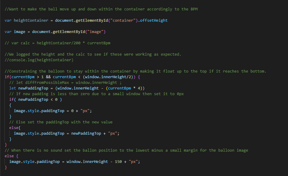
This week I got the balloon to move from down to up as it is more logical considering that it is based on low to high BPM. As we moved forward towards an object that has its own integrity.

The code that I used was the following:

Code to fix the logic of the sketch

The aim of this week is to work on finalizing the example and working towards the show and tell. We aim to make the example have more integrity. The first thing we wanted to change from the balloon example was that the balloon has its own preconceived notions which might affect how it is viewed so we decided to turn it to a more of an abstract object as could be seen below. We decide to only show a few examples and not all since the were some overlaps and some that were not as useful after executing the experiment. We chose to present examples Balloon 1 and 2, rectangle example 1 and 2 which you could see the insights of below as well as insights for the experiments that we did not present which we both wrote in a google shared document.

You can see this idea that we landed on at the end of controllable vs affectable where in the affectable, the rectangle has a life of its own where it doesn’t just go back like a controller which was an interesting since if we had more time in this project we would have worked more on it as it had more of a nuance.

Below you can see the shared google doc where we listed down the intentions, experiences, insights, questions, and what importance for designers of each example at the Show and Tell. (Al-Eryani & Isaksson, 2020)

Balloon example 1 (Only BPM, stepwise, no transition) –

Intentions

  • How would the interaction be where there is a continuous input of sounds?
  • How would the experience of 
  • How would the interaction feel if a balloon responded to BPM by placing itself on a vertical axis? 

Experience

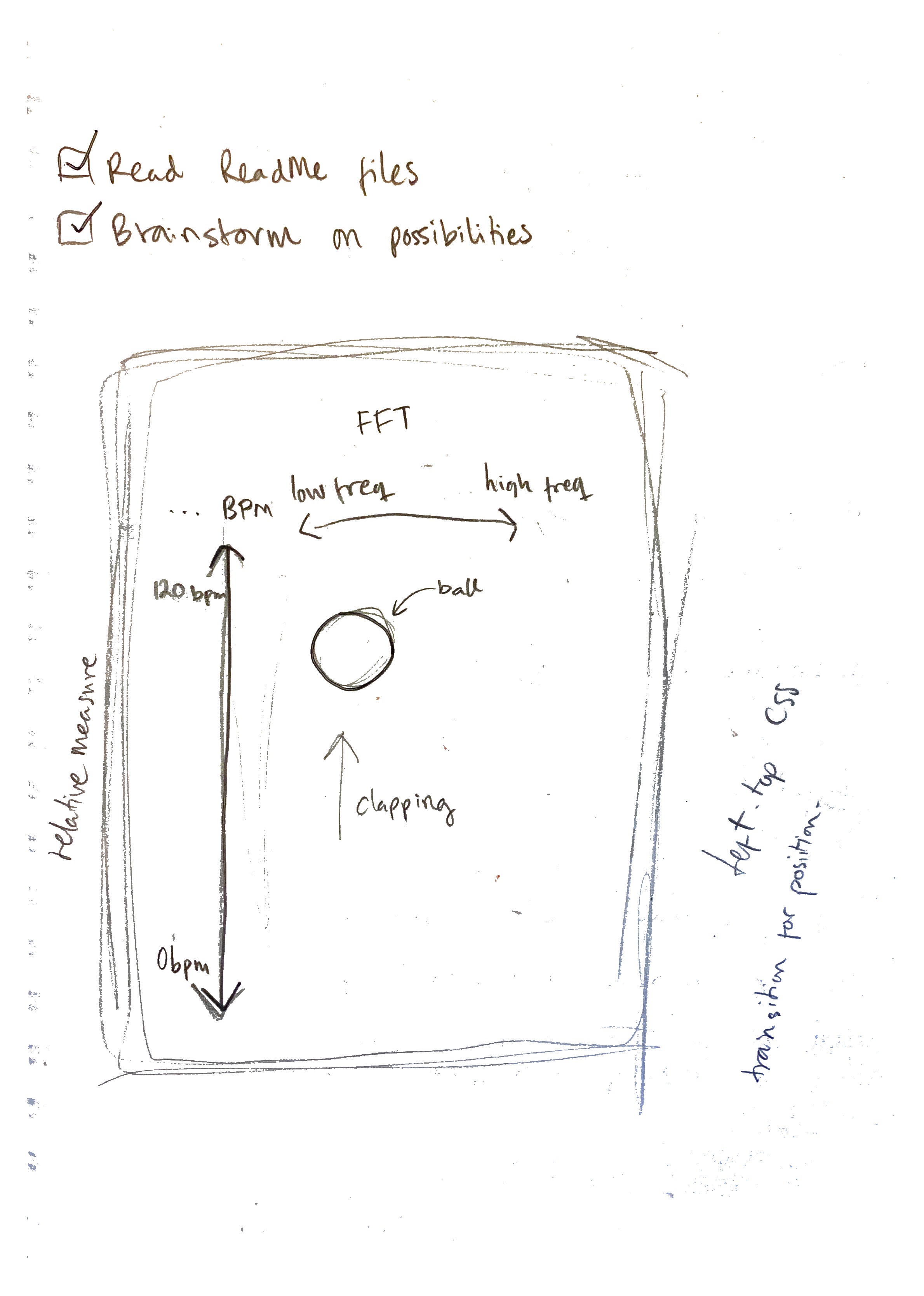
  • It was more logical to understand where you would get what place the Balloon is based on the positioning on the screen. (Top right corner: 0 BPM and bottom right corner: 170 BPM)
  • It became less like a game and more like a visualisation of the BPM data of your input sound. It does not take into account what type of sound input it is presented with. It could be clapping, speaking, writing on a keyboard etc. The output is still the same, placing itself on a vertical axis depending on the amount of BPM.
  • It felt like a secure way of knowing what BPM your sound input had since there was no smooth transition between the positions of the vertical axis. It was either one or the other.
  • Other than the delay of when you stop the sound input it felt very instant in showing the current BPM.

Questions to explore:

  • How would a more fluid interaction feel like?

Insights:

  • The value of a continuous input of sound 
  • How a the use of a display where the target object is always displayed rather than targeted

How is it beneficial for designers:

  • A continuous sound input gave more of a secure feeling where the it displays if it’s high or low BPM
  • A way of visualising BPM data of sound inputs

Attributes: Stepwise, instant?

Balloon example 2 (Only BPM, fluid, smooth transition) – 

Intentions:

  • How would a more fluid movement of an object be perceived? What is the main difference within the interaction?

Experience: 

  • It was a more visually pleasing interaction where the balloon wouldn’t be as jumpy as the first example. By implementing a transition “ease-in-out” it was less jumpy as the balloon transitioned smoothly between the different values.
  • It felt more like a fluent visualisation of data. How the value of BPM goes up and down continually.
  • Also feels accurate somehow, the BPM might not always be set on one value or the other, it can also move between values.

Questions to explore: 

  • How would the implementation of frequency change the experience? 
  • What if the output was more nuanced and took into account what type of sound it was presented with?

Insights:

  • It matters if the BPM continually changes, because it will transition more smoothly between values.

How is this beneficial for other designers:

  • Visually pleasing with smooth transitions
  • Still feels like a visualisation of BPM data, maybe more suitable for input that changes continually than having a constant input type (such as always keeping 100 BPM for example) (constant – inconstant)

Rectangle example  1 – (BPM and Freq, controllable) Object is merely mirroring the inputs

Intentions

  • How would it feel like to interact with something that visualises the data you put in the form of BPM and decibels in frequency bin 144?
  • How would it feel like to interact with something that is completely controlled by your inputs (ie no own integrity of the object).
  • What if the output was more nuanced and took into account what type of sound it was presented with?
  • What if what type of input mattered to control the object? (adding frequency to BPM)

Experience

  • It feels like instant interaction (except for the delay of the BPM). You can exactly see what your inputs are doing to the object. 
  • It reminds me of the example of how you write on your keyboard. It doesn’t matter if you type aggressively or calmly, the output will be the same (the letters you press will appear on the screen). That’s what it felt like with having only the BPM axis, then the decibels in frequency bin 144 input didn’t matter. But adding the code that took the decibels of frequency bin 144 into account, the output became more nuanced – showing different outputs for different inputs.

Questions to explore:

  • How would it be if the object becomes more lively/has its own integrity?

Insights

  • By having a Rectangle it became more of an abstract and non limiting of what it could be since a balloon has it set preconceived notions.
  • When the output became more nuanced in the way that it shows both BPM data and decibels of frequency bin 144 data it allowed for more skillful interaction. Now it matters what type of sound you make, because that controls where the object places itself on the page.
  • It became more of a uniform (interaction attributes) as it became more controllable and influenced by intuition.

How is it beneficial for designers:

  • It became more focused as we became more controllable as the idea became more converged, as well as having an object that doesn’t have preconceived notions.
  • It became more nuanced as a more skillful interaction was displayed. 

Rectangle example 2 – (BPM and Freq, affectable) Object has its own integrity

Intentions:

  • How would it feel like to interact with something that has its own kind of “will”, its own integrity?
  • How would it feel like to only “affect” the object with inputs rather than control it?

Experience: 

  • Feels “mutual”. Like the one making the input and the object are two individuals somehow.
  • Feels like the object has an agenda as well, it’s not just the “input-maker”.
  • Much less controllable.
  • It takes adaptation of the input to be able to steer the object to where you want it. You need to seize input and wait in order for it to go backwards, unlike the “controllable” example where it shoots right back when input has seized.
  • Reminds me of when you’re biking uphill and you hop off because it’s easier to “carry” the bike than to sit on it, because you have your feet on the ground that’s a force that challenges the force of the wheels to go backwards. Our object has a force of its own to go slowly back, you can’t make it go back faster.

Questions to explore:

How is it beneficial for designers:

  • By changing it and by it having more integrity it would mean that the interaction becomes more mutual.

These are the examples that we did not present:

Ball example (targeted) – 

Intentions

  • How would an interaction where only if a certain BPM is reached an image appears?
  • How would the experience be if you have to aim at clapping in a 100 BPM?

Experience

  • It became a challenging experience as we needed to reach a 100 BPM to show the image of the ball. It felt like a game, you felt a sense of achievement when you finally got the ball to show itself on the page.
  • As a way to guide the 100 BPM we had a headphone with a 100 BPM metronome as a guiding mechanism. With the help it was less challenging, but still challenging enough to get a feeling of achievement when the ball showed. Without the help it was very challenging and it became almost coincidental. It’s hard to know at what BPM you’re clapping, and you got no help from the object since it only revealed itself at 100 BPM and was otherwise hidden.

Questions to explore: 

  • How would it be if we had another object where we wouldn’t need to be a targeted interaction but a continuous sound input where it would react to the BPM?

Insights:

  • It was a challenging interaction which needed attention to reach the favoured outcome (targeted interaction attribute definition: Appreciation, significance of interaction, worthy of attention, high challenge, high concentration, room for competence). 
  • It allows for developing a skill, you can get better at knowing how to clap in 100 BPM if you get more and more familiar with the sketch.

How is it beneficial for designers:

  • Would an action like this be useful to implement? 
  • Inconvenience? Challenging? Gaming-purposes?

Claim that draws on the body 

Attributes: Targeted

Balloon example (BPM and Freq) –

Intentions: 

  • How would the example be like where the horizontal axis be related to high and low decibels of frequency in bin 144? 
  • How can it be described through the interaction aesthetic attributes?
  • What if the output was more nuanced and took into account what type of sound it was presented with?

Experience

  • It became more informative as 
  • The output is more nuanced due to the object responding differently to BPM input than to decibels of frequency bin 144 input. What type of sound input matters.

Questions to explore:

  • How would a more controlled experience be reached?

Insights:

  • It became more of a stimulating task (Psychology needs) as it became more exciting and playful to use.
  • It became more interesting as two different information data are visualized

How is this beneficial for designers:

  • by turning it into a graph like with two different data points as the interaction is based on the audio input it becomes more stimulating, direct and nuanced

Attributes: Precise, Direct

Show and Tell

Exploring & understanding the nuance of input and output

  • Balloon example BPM 
    • This example  shows the visualization of different  Bpm levels where the balloon moves vertically 
    • Understanding how different output affect the experience (stepwise – fluent)
    • Top left – corresponds to low/ 0 BPM
    • Bottom left – corresponds to high Bpm  170 bpm
      • Stepwise sketch more suitable for when the purpose is to keep a steady BPM, fluent more visually pleasing and suitable for when the BPM is continually changing.
      • Questions we wanted to explore:
        •  How would the implementation of frequency change the experience? Does 
        • What if the output was more nuanced and took into account what type of sound it was presented with? 

We wanted to explore what would happen to the interaction if the object reacted to more than one type of input, so we brought in frequency as a factor:

  • Rectangle examples (changed from balloon to rectangle because it’s more ambiguous and lacks preconceived ideas about how it’s supposed to behave) (also changed the BPM axis to start from the bottom and go up)  
    • It’s moving in different directions regarding the type of input, BPM on a vertical axis and frequency on a horizontal axis. Nuance in output because it’s responding to the nuance of input.

This led to us trying to explore how can the object become more lively/have it’s own integrity?

  • Controllable vs resisting, sketch #1 is only mirroring the inputs whereas sketch #2 is displaying an object that gets affected by the inputs but has its own agenda (to go slowly back when input has seized).
  • Sketch #2 demands the “input-maker” to be able to adapt to the object’s integrity to move it in ways the “input-maker” wants to.

Conclude with:

The contrasts between fully controlling an object and only being able to affect it, interesting because:

  • It makes the interaction more organic (like a bike is resisting an uphill ride – our object is resisting going back to the start).
  • It gives the object a character, more personified (own agendas, own logic etc)
  • It’s something that you can develop a skillful coping with. Learn how the object responds to different types of inputs and adapt your inputs to make it suit yourself.

If more time/competence we would like to explore more ways to include integrity in an object because:

  • It’s a different type of interaction than what we’re used to, i.e. the cursor always following your inputs, it’s not resisting.

Feedback from the Show and Tell:

  • We were told to be more critical when doing the experiments where we ask if we are achieving what we are aiming to do.
  • We need to pay more attention to when there is discrepancy when we are showing and telling match.
  • How does the speed/curves movement affect the object which is a point of further exploration
  • Undermines own work if you don’t push on what you want to do vs what it’s actually showing

More genral feedback during the end of the session:

  • By exploring a theme it means that there is success criteria to think of during each experiment.
  • Tweaking the parameter to push the experience
  • Exploring different inputs (Although we did discuss having audio as an input and output but we were told it would difficult to get it to work smoothly )
  • We didn’t stray away from screen based + color based output

These are some great thing to think about during module 2, while this was the first kind of Show and Tell that we’ve down it becomes more clear what is expected of us in the upcoming ones. We also tried to tie everything together in the end which we could of done better as well as reflect more in real time. Another point would be to work more on being critical of each thing we’ve done so we can bring it up in the show and tell where things don’t work as intended as an example. Overall there was a lot to gain from this module to use to the other modules for a better outcome.

Interactivity -Week 2

Over the weekend I was working on implementing a band pass into the playground example. Originally we were both supposed to work on the beats example but it wouldn’t catch the constant bpm. Which I later found out was because of the direction of where the built in microphone.

I tried to implement a bandpass into the playground idea but it was not so responsive as there would be other frequencies showing such as high frequencies. This idea could not really be built on so we decided to continue working on the beats example. This could be seen as diverging then converging in the design process. Thankfully there wasn’t much time wasted on the idea but it gave us an idea of what we will not pursue. (Update)

Instant – Delay video

My examples were Spotify related where the instant example showed a double-click on a song which played instantly. The delayed example showed a click on the artist’s page where it had a delay to load the page. These design attributes can be helpful to implement within our own work. There was a discussion on if they count if they are intentional or not. Another thing that it was it could be because of hardware of the computer that something has a delayed reaction. Once presented with this task, I was unsure on what I can find that will be based on those design attributes. Although these ideas I had quickly came as we had this time constraint of 10 minutes to look for one idea each one per attribute within the group. That time constraint really helped because I started thinking spotify as they have instant and delayed examples to look at. I thought of a xbox controller as well. These attributes really help conceptualizing an interaction which I think we can keep in mind for our examples. (Updated)

The ball appears when a the sound input reaches 100 BPM. From a design attribute could be seen as targeted interaction. We thought about how to implement natural/accidental sounds so we decided on trying to clap at a 100 BPM and how that experience would be.

By having this more challenging it became a targeted interactions, with an aim which made it a more challenging experience as well as it draws on body movement. It has an action-reaction coupling. We found this to be fairly simple example to try and start working tinkering with the code. We also found out that we won’t look further into the targeted attribute. (Updated)

The balloon moves when the sound input records the BPM on the y-axis where the bottom corresponds to high BPM and top right to low BPM. The experience of this was example was good at visualizing the input but still lacked in fluency. This example could be seen as Step-wise, Precise, and Direct. We knew that for it to become a better experience it had to become more fluent. (Updated)

By making it smoother it became a better experience as it became more fluent of things around it. We started thinking about other dimensions that we can implement and thought the next step was to implement frequency on the x-axis making the visual become more like a graph showing the data. (Updated)

We decided to push this example further with implementing the frequency. High frequency would be the top right corner and low frequency would be bottom right corner. The experience of this was more nuanced as this made the object more lively which in return made it a better interaction.

This example shows us using the piezo contact mic to see if it becomes a more challenging experience which it does since it didn’t catch a lot to what was happening. We then were told it is better to have it on the table although our initial idea was to have a clapping motion we decided it could be not as useful at this stage. Instead we started thinking of implementing the amplitude in our sketch. Ideas such as the image of the ballon becoming bigger.

Below are some things that we experienced as roadblocks or points of exploration:

An idea on sustained frequency and how the size of the image would change.
Becoming a game and implementation of musical notes
Implementation of amplitude
Ideas on average BPM and detection of loud sound and the balloon bouncing.

Clara brought up an idea of how to make one understand the different aspects of the balloon idea, where one would need to use both the frequencies to move side to side and BPM for the speed. While this could be seen as a concept we’ll see what feedback we get on that. I looked into finding a way for when a keyboard note is played that when it’s sustained then the image becomes bigger in size or start moving but that wasn’t possible at the moment to implement since it was difficult to get only one note to be detected when a key is played. It could be seen as limiting but it is important within a design practise to know things that you aren’t able to do.

Things we set to achieve on Tuesday and things to explore
The implementation of frequency into the balloon example
Balloon becoming more lively and calculated movement

Coaching: We had an idea to have an input and output of sound corresponding to the BPM and through embodiment of how fast one claps the song would go as fast as the BPM. This could be leaning towards a concept and can have many difficulties when discussed with Clint so we decide to continue building on our initial idea.

Aim for monday: For monday we aim to work with the “recent” example and see how we can implement that into our own example to make it more lively and react continuously with the surrounding sound. We also aim to make the object decoupled from the audio input. We would then try to have another object such as water reacting to the sound instead of the balloon which we will work on next week. I also aim to figure out the amplitude as I got it to work but it is not fully functional. I will also look into making the balloon come in from the bottom rather than the top and go from bottom to top as it is more logical with the idea of it being a graph of sorts.

Interactivity – Week 1

Today Clara and I exchanged journal feedback as we shared feedback that we had gotten from the teachers during the prototyping course. The following was the main outcomes of the exercise: I will aim to hand in the journal at every opportunity to get feedback on how to improve. I will aim to be up-to-date with my entries. I will try to be concise as well as being more reflective than descriptive. I aim to add quotes since they can help during the final essay assignment. I aim to be more expressive of points of frustration during the course work as they can show more reflection within the whole module.

We had some time to brainstorm some ideas on what sounds and skill that could be considered in different situations which could be seen below.

There were ideas where we knew that leaned more towards a concept than an exploration of what is at hand. The idea was controlling movements through specific musical notes. While our inspiration came from a children’s game called TuneMeIn “Easy doesn’t do it – skill and expression in tangible aesthetics” (Djajadiningrat et al , pp. 664, 2007). One would have to collaborate to make a character move around. At this stage we were Diverging and it is something that we will probably continue doing until next week. This idea of implementing sound as an output through a “game” could become too conceptual or sound respond to movement. An idea that could be interesting is the code detecting the different notes played on an instrument and reacting accordingly through the screen (Minor vs Major? or different notes A vs C)

There was an idea of having nature sounds in relation to working with calmness. Although I have used sound in the research/studio course in connection to aesthetics it could be good to implement this. It became an aspect where I have been using within the calming aspect of an interaction and how sound could be implemented within that situation. Since we also discussed nature sounds but haven’t really planned an experiment around it as of yet. On the other hand, we haven’t been looking at the code and thinking on what the nuance in this will be interaction what visual would we show, could we use audio as a feedback as well even. (Updated)

During Coaching we presented the different ideas that we had such as playing musical notes would correspond to certain movements on the screen, a controller of sorts. When talking about control of movement Clint mentioned an interesting aspect that could frame the exploration is the orientation and direction through the experiences within the code. It became apparent that that wasn’t the way we should go about it since we haven’t played with the code so we can see what we can do with it.

Before we left we made a plan to work more on the codes and have an example to show each other by Monday. As well as design attribute delay and instant, where it could be seen as intentional or if it’s a design flaw which is also due Monday.

The process of efficient Prototyping

Abstract

This essay is about how the prototyping process and be effective with the use of manifestation and filtering dimensions. How big of a role user testing plays in efficient design practice. The insights come from on a project where we needed to make a prototype based on communication in sports, where the user would not be able to use both hands to answer a call or communicate to others generally.

Introduction

Effectiveness in prototyping could be based on multiple criteria’s during the different phases of the design process. This essay will be about prototyping efficiently through an exploration of what the implications are for design practices, as well as if the framework a practical one and what the challenges and opportunities might be with prototyping efficiently. The project that will be referred to is Project 2, where we had been given a design brief based on communication in sports while your hands are busy. This had limitations on what the prototype could not be, such as something that would change the sport that it was intended for. Through prototyping everything you produce can be used as knowledge of what the artefact is going to be by knowing what it is not going to be.

Exploration of Ideas

One way to reach effectiveness is through pushing the boundary and exploring different ideas. It could be said that while sketching you get too hung up with your ideas, which you do not try and push the idea to the next level or find that it is a dead end. Even then a designer would have a narrower idea of what a prototype is going to be, by knowing what it’s not going to be. An example could be during Project 2, in the group we were making a 5 button programable controller for people doing sports. In the beginning we were invested in this idea of having a removeable buttons since the user might not need 5 different commands so why not give the user the option to have 2 or 3 buttons. We decided to make a quick and dirty prototype aiming to have a look & feel prototype. After that we tried to push ourselves more by coming up with more options that made us end up with a circular model with four buttons around and a circular one in the middle. This corresponds to what Michael Schrage wrote in ‘Crafting Interactions: The Purpose & Practice of Serious Play. In Prototype: Design and Craft in the 21st Century’ he stated the following on how a prototype is like a hypothesis part where he has a list of why that is, number 4 states “A mere assumption or guess” (Schrage, 2013). This raised the question of the real need to limit something that does not need to be limited since we were assuming a need or an unnecessary feature for the users. That in return helped us get a narrower idea of what we can explore and to continue ideating.

Trying to Break the Idea

Having alternatives to an idea is an ideal place to be in the design space. Exploring different features or untapped areas of a design could push your prototype to different level. Furthermore, input from potential users is very important in being efficient during the design process. User testing is a vital part of prototyping, since you get too connected to your ideas. “Prototyping is key means with which an individual\s imagination is tenaciously explored, tested, broken and rebuilt” (Valentine, 2013). This can show that people get too used to comfortable with their idea that they think is perfect, but they must continue pushing the idea to be broken as Valentine states. A great quote in ’The Anatomy of Prototypes is that’ we conceptualize prototypes as tools for traversing a design space where all possible design alternatives and their rationales can be explored” (Lim, Stolterman & Tenenberg, 2008) which is what we tried to do until the end. We went from getting too focused on one idea we had and needed to take a step back to try to break the idea a part. For example, we tried to find the breaking point of how many commands you can have. We did that by using combinations to see when it would be more convenient for the user to just take out their phone rather than use the device. Moving from the superficial design space where it’s all based on what the designers think is needed is different from finding people in your target user group and asking questions. During the project, it became clearer when we interviewed people about what they needed by giving us feedback based on the different options we presented. For example, when interviewing people in the diving business they said that having buttons was better than a rotating nob controller. Decisions similar to that cannot be made as a hypothesis at that point but based on user testing methods.

Using filter dimensions

A vital part of being in the prototyping phase is using filtering dimensions. Prototyping profiles is a description of each single prototype based on the prototype’s anatomy of prototypes (Lim, Stolterman & Tenenberg, 2008). Each example could be when certain parts of a design are prototyped rather than completed in full. Filtering dimensions is made of 5 different groups which include Appearance, Data, Functionality, Interactivity, Spatial structure. During the project we had focused on different part to explore near the end of the design process, where one pair focused on the functionality through interviews with potential users. For appearance a pair was exploring different ways to make the prototype look like in different situations. The last pair concentrated on the interactivity and spatial structure through experience prototyping. We did not concentrate on Data until the end where we had to make a choice if we should include numbers on the remote pad or not. ” the best prototype is one that, in the simplest and most efficient way, makes the possibilities and limitations of a design idea visible and measurable.” (Lim, Stolterman & Tenenberg, 2019). Through the use of high-fidelity sketches of many alternatives of what we found limitations and breaking the ideas a part to make it more measurable and ideal for the sports we were focusing on. Functionality is something we had explore well since in the beginning we were only thinking of how a person doing a sport can communicate with others. For example, sending a pre-programmed message when someone is calling you. We then thought of how we can make a communication channel for people using the device, that is when we explored how each colour would mean a specific thing chosen by the pair. By doing that we achieved a sharper narrower position of what this device is going to be.

Using Manifestation dimensions

Using manifestation dimensions could play a huge role and how to view the design practise. Manifestation dimensions focuses on Material, Resolution, and Scope. While working we had an idea of what materials our prototype would be made of. It is about limiting ourselves of what we should do.” the best prototype is one that, in the simplest and most efficient way, makes the possibilities and limitations of a design idea visible and measurable.” (Lim, Stolterman & Tenenberg, 2019). We knew what we needed to do in making it in physical media. Moreover, knowing what tools we have at our disposal. For resolution we achieved that by showing the interaction part of the prototype where we used Adobe XD. We used it to show what happens when a button is pressed and the feedback one would get. For scope we chose different colors alluding to the different messages as a means of communication on the interface. By using the manifestation dimensions, we can have a more efficient design practice since one would know what to focus on, in return the idea would be sharper than it would had been. Furthermore, it can mean saving time and material. Limiting the idea is best to do in the design practice. An example of that is that we realized it was unrealistic that we make a device that would be perfect for every single sport for communication. After we focused on two sports, biking and swimming we thought of how it could be implemented in other sports. We found an opportunity to have it in the setting of working out in the gym and skating. We found this out through experience prototyping and interviewing people who do recreational sports to see if this would be of use. The idea came initially since we found an article about how people lose in focus through smartphones ruins the workout.

Importance of User Testing

During this process many can run into issues with knowing when it is time to go to the next step. You can not follow a plan fully, since sometimes you are behind and sometimes you might jump stages within the process. It is crucial to try to question everything by user testing method of think aloud method to see how a subject from the target user would make sense of things. By just hearing the pace that they are talking in could relate to the analytical focus, as well as understand potential users reasoning. Keep in mind that this method has disadvantages such as it being a situated use tends to diminish, adding on self-reports not being authentic or complete thought. User testing is an important tool to confirm real need and applicability of a prototype.

Conclusion

In conclusion, efficiency could be different things in the design space. Exploring ideas that you try, and break is vital. Getting feedback from potential users throughout the process is of value that aids an efficient design process. That is because designers can know if an idea has real need. Furthermore, being able to really take the time and use the filtering and manifestation dimensions could improve the prototype. The dimensions could sharpen and make the design practice much more efficient since it focuses on the important parts of the process. More effective not only in time but material as well. Quick and dirty prototypes can be very useful since you can have a look & feel of the design and see if you can manifest the idea. All these different things help in making a narrower and sharper idea of what you are prototyping.

Bibliography

Buchenau, M. & Suri, J. F. (2000). Experience prototyping. In Proc. DIS, 424-433. ACM.

Lim, Y.-K., Stolterman, E., & Tenenberg, J.  (2008). The Anatomy of Prototypes:  Prototypes as filters, prototypes as manifestations of design ideas. ACM Transactions on Computer-Human Interaction, 15(2).

Schrage, M. (2013). Crafting Interactions: The Purpose & Practice of Serious Play. In

Prototype: Design and Craft in the 21st Century, p19–28.

Valentine, L. (2013) Prototype: Design and craft in the 21st century. Bloomsbury Academic, London

Project 2

Week 1

We decided on working on designing a communication tool within sports where the scenario is being not able to use your phone so we would need to make a communication tool for a sport or more preferable since the design situation it would be mass produced and not of niche use. For our first critique session we needed 5 concept sketches each and then pick 5 to show the teachers.

Sketch 1

The idea was to have a buzzer which would cause haptic feedback to the other person on the team so you don’t both go for the same birdie while playing which in return would improve communication. This would be on badminton racket.

Sketch 2

My Second sketch would be used in basketball where players would have a clip on speaker and the coach would have the controller so he/she can communicate to the players while being more discrete than just shouting out orders.

Sketch 3

My third sketch is similar to my previous sketch which is that the players would have a built in speaker in the collar of the shit and the coach can speak to the specific players he want to speak to. In football you are allowed to speak to the players but this can possible be a training tool since I doubt such thing would be allowed in competitive sporting events. A pro is that this wouldn’t impact the actual game since coaches are allowed to speak to players throughout the game.

Sketch 4

My fourth idea was to have a formula 1 glasses where while focusing on the road you can see how far the next turn to be more prepared. This idea is not based on knowledge about the F1 but I’ll research more into it if we need to. On the other hand it can also be a great training tool during driving tracks as this can improve the driving.

Sketch 5

For my last concept sketch its based in football, and is similar to the previous concept where a player would get information on the glasses to who to pass to for example since it can be hard to get in the box if players wave to get the attention of their player with the ball but they also risk getting attention from the opposing team’s defense.

Critique session 1: We were told we needed to base our concepts on actual research which was a misunderstanding since we did research but assumed parts. All the concepts can be based on personal experiences of some kind. for example the badminton racket idea came from me seeing two people on the same team going for the birdie and ended up by one of them fracturing their finger. After the critique we decided on going to the different places to ask questions of things that they believe are needed and what means of communication that they use. I will be going to badminton and Tennis courts for next week.

Week 2

I went to the tennis and badminton courts to ask questions- couldn’t find someone that played duo’s in tennis but found 2 people playing that said you can’t really communicate in matches when the ball is on their opponents side but can communicate when the ball is moving towards them and for badminton they said that bad communication could lead to collisions or rackets hitting each other. They can communicate with hand signals about how they will serve. The communicate as well when each other are doing good shots as encouragement. For For both For Tennis and Badminton they said that they don’t know what could be introduced that wouldn’t change the game experience. I guess a positive side to this is that we are narrowing our concept of what we can work with.

We are exploring a programmable pad button where its made up of 6 buttons where you can program whatever you want such as higher volume, lower volume, answer call, and declining calls. you can see the sketches and a lofi prototype below. While researching we found out that 5 is a perfect number for buttons (https://www.psychologytoday.com/us/blog/behind-online-behavior/201410/the-psychology-choice) and to think of remote controllers where the middle part has 5 buttons is also an interesting thing to keep in mind. As well as how people use the phone while exercising the link between loss of focus and exercising (https://time.com/4637895/exercise-smartphone-workout/).

Week 3

I was working on Experience prototyping and Storyboards.

These are the Insights from going to the Gym and biking without being able to use the phone:
At the gym and while I was biking I wanted to play an album and skip songs.
I wanted to see what time it was.
I really wanted to answer a call while biking which took a bit of a wait for the vibration to turn off since it took some focus away.
I didn’t mind the notification vibration but maybe since I normally have don’t disturb mode on when I go to the gym.

Nahid and I did another experience prototyping where we tested numbers and colors as a way to mean different things such as give me the pen and other commands but it was easier to us colors than remembering numbers as it catches your attention. During the critique when we presented the 5 button remote Johannes said something interesting that we had to think about which is finding the breaking point where using a device like this becomes too difficult and it becomes easier to get your phone. So that was what Nahid and I tried to investigate this week. We also had an idea of having a display of icons which can become easier to understand than colors and could be up to 5 people communicating through the device to each other while biking for example where you can see below that if the one user wants a break how the interaction would look like for accepting a request or declining.

Interface reaction sketch

You can see the storyboard Nahid and I made of a gym based situation where Nahid needs a spotter while I was running and then we communicate through pre programmed messages for the gym situation. This is a storyboard to display the interaction/communication with the use of our programmable 5 button idea.

Experience prototyping Storyboard example

Augustine and Sara were in charge of sketching ideas and of course we all gave out oppinions on the different subjects as was agreed upn in the group contract. We also looked into biking as a sport that it would be used in so we explored where it could be for example on the steering wheel or a watch type of thing. My and Frans went to interview people that work with diving and diving equipment and they liked the idea of having a fun and easy way to communicate with others. So biking and Swimming are the two sports that we will focus on but it could be used in other sports like skating.

Design ideas for programmable command artifact

We decided upon having color as masages connected to a number which in return would be easy to remember since it is easy to connect words to colors for example. You can see the different ways to communicate below as well as the final design.

Unfortunately due to the shutdown of the workshop due to the COVID19 we weren’t able to 3D print our prototype as we initially were about to do before the shut down.

Week 4

After our critique section we got good feedback and we were told to put our device into context. So my role was to put the device into context. For swimming, Biking, Skating, and the gym. Which you can see all below.

The aftermath: during the presentation we got valuable feedback about how we should of had photos of the artifact in context from the very beginning so the don’t have to wonder what it looks like. Johannes liked the POV bike image since it was straight to the point while he questioned the diving one for the positioning of the device for one of the people in the 2 way communication example. We should have explained why we are using lights during the presentation more which is understandable as well as maybe having a video where the device is in use during diving as an example.

Beyond the norm

There are 2 different design groups for prototyping. There is Affirmative Design which follows the status quo of global capitalism and Critical Design which rejects the process that emboidies alernative social, cultural, technical or economical values (Dunne & Raby, 2001)

Dunne and Raby 2009 release A/B, A Manifesto where they make a distinguise between Affirmative and Critical words for example Affirmative would use problem solving and Critical would use problem finding.

There are critiques of critical design such as is it actually critical? and what counts as being affirmative? and who decides what is affirmative?

Speculative design is another kind of design way where it focuses on imagining and using images to show something which is focused mostly on science and technology/ futuristic while critical design is dealing with now.

Design fiction is Acknowledging a connection between science fiction and science facts such as sketching the future without thinking of the technology that would be available and wouldn’t with the thought of having people resemblance. Compared to critical design, speculative design keeps in mind how an object would fit into the wider scheme of things i.e. the world. Speculative design doesn’t comment or critique.

API Lab

We started by choosing a library within the group to make 2 examples each by the end. We decided on using Pop Motion as the library we were going to explore. Pop motion is an animation library and I explored using Every Frame, Inertia and Tween.

I started by making a wave type of animation where I used the Every frame and Inertia that are found on the Pop Motion website. Peter liked the idea but It was still missing a real use. This was a pivotal part of the examples which I didn’t know that it should have a real use when I showed it to him. I decided to use this as a building block to make something more useful that could be used in different situations.

My second example explores another way to animate the done/submit animation where a by the help of tween of two parts of a check mark merge together when the submit button us pressed which you can see above. This was an idea of making a submit button more satisfying in the end when you are done since there aren’t that many that I have seen that give you a great feedback on completion or maybe a better user experience as such.

For my final example that can be seen above. My example uses inertia and  the Every frame animation from the library as the base. My example explores another way to show responses to different questions through having a slider adjust the expression of a face linking to how a person perceives a question. It was an attempt to visualize the idea of surveying people through a numbered ranking. This could be implemented in any kind of survey that would otherwise use a numbered system to collect data about how people feel about a subject . In this example the subject would be the weekend.

I learnt to really search for shortcuts such as using something called SVG since for the submit button example for the two parts of the check which made it a much easier process to make the example than the survey one since that one was more experimenting with codes to eventually making what I needed. This can relate to what do prototypes prototype where “Prototyping is key means with which an individual\s imagination is tenaciously explored, tested, broken and rebuilt” (Valentine, 2013) which would definitely describe this project through trying to make my ideas work and explore ways to make them how I envisioned them to look and work like in essence.

Connectivity workshop

We tried to connect our computer and phone to server using the IP address which would show data within the browser. It didn’t really work for me because I had to be connected to the university’s internet. I saw my friend get it to somewhat work and get the motion stream to work with all the information concerning the phone showing on the browser screen. Even though I couldn’t get it to work it was cool to see that you can connect your phone to your computer and do cool things like arudio related things for the final project in this course which we will get another opportunity to learn more about it when we are doing the final project.

CAD and 3D Printing

We are using Fusion 360 as means to 3D Modeling in this course. Fusion 360 is a cloud based software where you sketch things in 2D to 3D. One can quickly iterate using sculpting tools to change form and modeling tools to make final features. Fusion 360 has possible outputs such as 3D printing while exporting in .stl file format, to render what you made into images, as well as blueprints for a final prototype.

3D printing started in 1986 by Charles Hull founded 3D Systems and in 1989 Stratasys was founded by S. Scott Crump and Lisa Crump. The 3 types available at that time were SLA -Stereolithography, FDM- Fused Deposition Modeling, and Laser Sintering.

Getting to know about the UltiMaker and its materials such as ABS- Acrylonitrile butadiene styrene which is made from petroleum, has a matte look, it is also easy to sand and can be smoothed out with acetone, it has mild flexibility, and can handle high temperatures and needs higher temperature than PLA. PLA- Polylactide acid is made of natural starch such as potatoes, it has variants of transparency states, cannot be altered after being printed. It is strong and rigid. In comparison to ABS it has sharper corners and tighter bonds in the printing.

Experience Prototypes

We had an activity in store where we had a design proposal where we had to try experience prototyping where we had the flexible reader case. We needed to test experiences where you can use this or would use this.

We started going by the dimensions given which are 20 x 40 x 5 mm so to imitate this we used paper to see how this flexible reader would hold up in different situations. Firstly when it was crowded on the elevator it was okay to have but hard to find a place you can actually put it in like the back pocket which could cause issues to the flexible reader.

We also went out where it was windy to see how it would work in that environment it was difficult to have it with one hand but it was okay/ you would be able to read from it but at the same time we were out it started to rain meaning it would have to have water proof material as well. Another pair in our group tested if it would be better to have this kind of technology over an ipad and they found out that it was easier with the flexible reader. Another thought it was better with the privacy to have a flexible reader since if someone is peaking you can have a confined space/privacy in a public place like an airport for example.

Technically I have done experience prototyping before this at the first course where we made a prototype of how interactions and if the size for buttons is good or not which makes one think of what else one does without knowing it has a specific name since in the example above we just said try to imagine the interaction with the device if it was functioning while now we have the correct terminology.

User Testing

An important part of user testing is knowing to distance ourselves from our ideas since we try to protect our ideas and think that they might be complete when in reality the design process only stops when the deadline comes along.

Testing a prototype with potential users is of essence with a foucus on usability and mainly undestanding the concept by asking questions that might be of intersest for them. It is not about counting how many people would use it and wouldn’t since opinions are not really of use here. Example of what User testing could be are observations, think aloud, video analysis, and use & interview.

For observations you will need to think about what people do & how they do it. There are different categories such as when, where the focus is on the observation of the interaction with the prototype. During observations one should set the scene and show what the idea is. A con could be that it is time consuming and maybe don’t have the skill to set the scene for people you are observing.

For video analysis one could see things one might have not seen at first glance such as movement, gestures and the mistakes which having replays and clips that can be used as reference points could be useful. Cons could be the camera positioning could be intrusive and might affect how the subjects acts as well as the context can be lost since it’s just focused on one part. Questions that could arise could be how do they try to use the prototype and what mistakes do they make and do they locate what you intended for the subjects to locate and do.

For think aloud method you try to see how a subject would make sense of things. you can tell by the pace of them talking could relate to the analytical focus. It is a goodway to understand people’s reasoning. Cons can include that the self-reports not authentic or complete thought as well as situated uses tend to be diminished and ending with an analyzing what you got.

For Use & interview it would be based on a discussion which is grounded in life experience. It would be particular topics that need to be dug into more as well as following up on quantitative data. Designer would take a more active role than the others as well as having more qualitative perspectives on a thing. Cons could be that it could be time consuming finding people willing to have a discussion as well as them being comfortable to push the discussion for it to have some sort of value.

To relate the design process to music when you are working on an album like the likes of Kanye West where he finishes the songs meaning mixing and mastering or tweaking some lines the day of the release meaning some of the albums he was working came the next morning after streaming release parties which in an environment like that where you have a lot of people where you can see their reactions it can spark changes to the different songs that can be done to elevate his ideas which these release parties can act as a user testing opportunity.

Project 1-Queuing

For this project we were assigned a word in each group and by the end of the week we needed to come up with a prototype and present our findings. The world that we were assigned to was calming.

We started by making a mind-map of how calming looks like, how it feels like as well as where it can be found. After that we decided it would be helpful to make a mind-map for what not calming feels like and where it could be found as in situations since we were stuck in our thoughts.

We decided on asking what people preferred as a way to tell time where we 3 options which are shown on the image above. Most people preferred the first one so we decided to have an experiment where we have 2 people, where one knows how long they will be waiting in the room while the other doesn’t. We found out that infact it would be helpful to know how long the wait would be. From that we came to our final idea which is having a booking system in a supermarket.

Ways of Displaying time
Final idea

We have all experienced going to a buy a few things at the store and having to wait a long time at the supermarket. By having a booking system that could be a more calming situation for everyone and not needing to stand and do nothing. An alternative of being able to walk around the store while waiting if you are waiting for your time could still even be better to be able to do something else.

Lo-Fi Controller Prototyping Workshop

For this workshop we had two days where we had to prototype a way to play games game through utilizing the Arduino as a means to make the different controls.

For the first day we were 6 people in the group so we decided to break up to 3 groups with having the same idea of controls which are the basic, up, down, left, and right movements. We thought of having Pac-Man as the main game we had in mind. We decided on having different sizes where we had different things we could explore. Emil and I had the small prototype where we had a ball kind of thing wrapped with aluminum and had copper tape on the different directions. We found out that Johannes enjoyed that the ball can represent the Pac-Man as well as him rising the question of what is fun? as in is it fun that it is hard/challenging or should it become more of a joystick kind of thing. These questions helped us in our second iteration the following day.

The next day we started with a smaller model of how another mini group conducted their game controller. We had 3 different sizes and ways to play, one was with a helmet kind of thing, the other is a two handed controller and thirdly the one handed controller.

So we decided to work with the box idea where we do not use wires from the bottom of the box but rather have a ball covered with aluminum and have a ground copper tape and copper tape on the wall as well, this meant that we would offer a better user experience since it is more realistic. You can see the hand held controller, Head controller, and both hand controllers respectively below.

The idea of fun is different for different people. Could it be more fun to be always few seconds ahead to make the decision since it takes more responsive time than the hand held prototype. I believe it is fun when something is hard and functional since you know it is possible to do what you need to do. The most responsive would be the smallest one which is the one hand held controller. The responsiveness is of very high importance since it can work for all games that need responsiveness which is a big part of games since a lot of the games even the ones we used as examples need the user to not just have high reflex but also be able to a few seconds ahead of the movement needed.

I can relate this process of iterating on a product and making a some what more polished version of a prototype to music production since you can test out different sounds so what you begin with as a full song is not the final one. It is also found when writing lyrics, the more you use the lyrics and read them the more you will switch things or change things around. When making songs I usually make a couple of different versions of the same song with differences in mixing, lyrics, delivery and having different ad libs or background sounds.

Design Lab

As an introduction to the machines in the design lab we were given a challenge to make a step stool and the ones who use the most machines would win but it was mostly to start using the different machines.

Paper (Lofi) prototype

We started with a paper prototype as an idea for how it would look on the end. This was a very helpful visualization tool for everyone. After that we decided to distribute the one wooden plank into the different pieces and the different measurement.

Using machinery
Issue with measurements.

We encountered an issue where two legs were not close to the top part, that meant that we had to come up with a solution, so we decided to sand paper down the sides of the top part for the legs that reach it so the can all be on the same height of connection. It is a normal part of a design process where you constantly have to iterate and come across things you thought would work.

Final prototype

You can see the final prototype above where we decided on having a cloudy type of shape for the stool. All of this was screwed together except the top part where we nailed it to the lower part. At the end our stool worked and we even got two bonus points from Mattias since he liked how well the construction and the different design was. We used all the machines except the planer and another one. Looking back we could have used it in the beginning so our wood would look better and more professional.

Video Prototyping Assignment

We got an assignment where we needed to build on one of the given prototype videos seen on the slides were were given and build on with a new consumer use and make a video of it. In the beginning we decided to give ideas on a few of the products that we thought were feasible to make something new out of. We choose to build on Morphee since we wanted to work on making a patient arm band.

While presenting most people understood the different points in the story line. But one person was not sure if the person went out of the hospital and was still being monitored, maybe we could of had the shot where she sits down because it could be a jump. Another thing that some people did not get was that I was a nurse since I had a tag with a red cross so maybe that scene we could have been a longer scene since there is a text message on screen which has the most focus. People thought it became hectic when the crisis was presented which was an intention that wanted the audience to experience.

It was pretty impressive what you can do with the use of film as a medium to express a story in less than 60 seconds. I can relate it to making music, since I have made songs where they are less than 2 minute songs which I think connects to have what I need in a song by setting the scene and a deescalation which is similar to the an 4 bar intro and a 4 bar outro of a song.

Electronics and microcontroller workshop

During this workshop we needed to use Arduino as a means to do things in the workshop. We got introduced to different challenges such as setting up programs that have a knight rider theme where the light would change.

This was the first time that I’ve used an Arduino and it took a few to get used to the basics since in the beginning I was behind trying to install the program needed so I missed the positioning where the number corresponding to the micro is to the right of the number not the left so after that I decided to look more into it on the internet to practice some more. I found that helpful since I was building new knowledge about something I’ve never used before but have heard about. The course needing us to buy our own Arduino’s is a push to expand our knowledge at least for me.

I can relate this to learning about the process of mixing and mastering, since you can do a lot of things and sometimes things won’t work but you can make what ever sound you aimed to have with constant work toward seeking that knowledge which is what the Arduino workshop is pushing me to do.

Dissecting Prototypes

When dissecting prototypes we need to think about how they would work, how we talk and find an opportunity for prototypes as well as being resourceful while prototyping.

The qualities of prototyping are Tenuous, Material, and Present. firstly Tenuous meaning shifting from abstract to concrete ideas while keeping some parts unspecified helps the ideation area while at the same time not necessary finishing it all. Material must be in thought when thinking of the idea’s and shouldn’t be left till the end. I also learned even what could be considered a waste of time could be a step toward better prototype and more knowledge about a certain subject. When presenting make it an experience having a low fidelity could be an advantage since you have time to build on input from other stakeholders. The purpose of Prototyping is to have a look & feel of the role it plays then implementation of its characteristics.

Five Dimensions of fidelity (Mccrudy et al. 2006) :

  1. Level of visual refinement
  2. Breadth of functionality
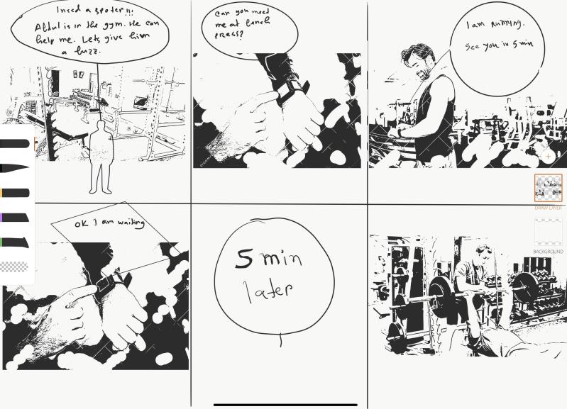
  3. Depth of functionality
  4. Richness of interactivity
  5. Richness of data model

Mccurdy also says that prototypes can be a mix of both low and high fidelity meaning it could be a “mixed” fidelity. There is also something called filtered dimensions (lim et al. 2008) which include Appearance, Data, Functionality, Interactivity, and Spatial structure. There is something else called Manifest dimensions (lim et al. 2008) which include Material, Resolution, and Scope. These models help sharpen the purpose and plan such as finding opportunities for your design such as a change of material from wood to plastic.

What is Prototyping?

During this first lecture we went through the importance and what prototyping is. A big part of prototyping is fighting uncertainty building an understanding of the problem and iterating the solution as well as effective ways of prototyping.

Designers need to know who they are designing for, the material and, the concept as well as if there is a real need for what you are prototyping, an example could be google glasses where if you think about it without doing real research of the wants of a group of people then it might seem like a good idea but if you go into the real world there would be a lot of people against such device which led to a global ban of the product.

Prototyping is a way to engage with different materials and throughout the process you would probably have different inputs from stakeholders of value and if this materials and idea would be best or if they have more input based on their experiences.

The concept could be narrowed through field research meaning a more narrow and clear idea an example could be through observations and interviews you get a better perspective of what different people think about their needs and you can find out if there is a common ground between people you have interviewed and maybe you need to focus on one group of people’s needs instead of trying to please everyone.

It is important to try many times and fail as much as possible to have the best outcomes in prototyping as well as being open minded to different ideas and not just stick with one and make different variations of a single concept. It is best to start with low fidelity prototypes then High fidelity for the final product.

I can relate this process to music production where you may try things but then change the samples, chord progression, or drums as well as experimenting with sounds. After having a melody everything can become clearer on what vibe this song will have and if I would want to alter it sometimes just adding random drums with the melody can show you that you may need to change a thing or two about it.

Netflix Gesture Exercise

We were introduced to an assignment for us to mainly get acquainted to putting clips together

Looking at the different gestures, it could possible be a very simplistic since they are gestures that are very possible made by mistake. For example, the skip gesture could be not as helpful since if there is a fly and you try to slap it away it would skip the episode that you are watching. On the contrary, all the gestures could be easy to understand and use since it is logical. By moving you hand down; it lowers the volume, by moving the hand upwards it will higher the volume. These movements could be made by mistake as well for example if you are going to scratch your head it could conflict with this gesture design. For the mute I chose a similar gesture to that in music where sometimes they clinch their fist to signal a stop in action i.e. in choirs. An issue could also be if you are trying to catch something like keys or a small object so it would mute the show that you are watching. For the Pause and Play gesture I decided to have it similar to how you press the same placement of the button in video mediums, so I decided to for it to have a similar user experience by doing that gesture to play or pause.

Sketching and Video Prototyping

Today we talked about the importance of sketching and how it is connected to prototyping as well as the elements of Video Prototyping. We got introduced to two Video Prototyping assignments where one is invidual and the other is a group project.

For the sketching part of the lecture, we did an exercise where we did a portrait of an image we say. Johannes said we can view each part as a shape like for example the lips were made of triangles. This can be helpful since I am not the best sketcher so to view everything as “flat” rather than a person for example makes it easier to work on the image. I plan to continue sketching everyday for at least 10 minutes to improve this skill to make the ideas I have become better/clearer when I put them on paper and hopefully I will be able to improve the details that I put into a sketch in the future.

For Video Prototyping we talked about having a story to tell where we set the stage then present the audience with the problem at hand. We also talked about the different camera shoots as well as looked at adverts/examples of video prototyping.

I have learned from this that videos and sketching are considered prototypes, since my idea of prototyping before hand was a tangible object where it has the important/main functionalities at hand and using effects on the video to make achievable functionalities present. Things such as a different effects of the different camera angles and when to use them. We saw an ad were the angle felt wrong when we saw it in class. Where we saw that the it took a while to present the contexts and the issue where it took 27 seconds for the viewer to start understanding what they are presented with. A good video prototype would show the issue in the first 10-15 seconds and would not have unnecessary shoots.

Design a site like this with WordPress.com
Get started